First let me say that I think your image did meet the challenge, although the score may have suffered because it includes extra words.
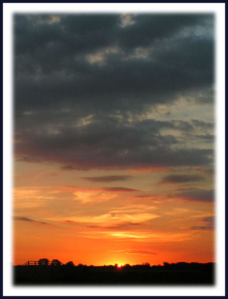
I commented on the image during the challenge, and I stand by what I said (and I now see that a number of other people agree) - the border really detracts from the image IMHO. That point aside,
Composition:
Good - I like the large sky, but I think a little more of the silhouetted "ground" would help the overall feel.
Focus:
Good, but has room for improvement. The sky is a little noisy as well - you might consider running it through Neat Image.
Color:
Beautiful. Really nice rich natural tones in the sky.
Overall:
A very nice shot, but one that could be even better with a few adjustments. Remember, this is just my opinion, so take it or leave it as you like. :-)
The title is quite a stretch. The border detracts from the image. This would be a stronger photograph if there was a clear subject; sunrises are so common that they lack impact without something to fixate on.
The image is a bit noisy overall.... I positively HATE the border (but that's just my humble opinion) I think the reason I dislike the border so much is because this is potentially such a great image. I love the colors. The title is way too far of a stretch for this particular challenge.... This is a great example of extremes... I love some aspects and dislike others... Overall it's a bit of a wash.
Nice shot of the sky. I'm a bit distracted by the large white border as it's so very stark against the colors of your photo. I do like the small amount of land at bottom.
This is an attractive image, but the border really kills it for me. Normally I don't complain about borders, but this one really detracts from the beauty of the shot (IMHO).






 Add photograph to your favorites
 Add photographer to your favorites

 Photographer found comment helpful.


