I'm new to DPC, so just starting to look around. This was a great choice in going monochrome. The composition became much more forceful. Wish I'd been here for the voting.
wow, what superb lighting and post processing. the composition is beautiful, and the model is stunning... i love that against the rough ground and background. perfect shot. great finish, too!
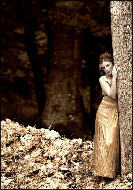
This really is a fine image. First like most other people here I really enjoy the colours.. the golds mix well with the sepia-like toning. The colour combination itself has a certain elegance to it, which of course enhances the image's overall appeal and effectiveness. Second I really enjoy the composition. Not even so much the placement of the girl within frame, but more so in the play with the layering of perspectives.. the sharp bright foreground and the blurry dark background.. divided and offset nicely with the girl and tree. It is superb.. the viewer's eye is essentially forced to stare into her eyes and face.
There have been a lot of points made by other people regarding the highlights and sharpness.
Yes. The highlights are intense, but I think the image works because of this. Imo it wouldn't be nearly as interesting to look at without them. The girl would appear too ordinary and the scene would loose its ethereal feeling. Blown highlights are a natural consequence/result of the high key look/effect. Don't forget, too, that monitor calibration has great influence on an image's appearance. Obviously calibration will vary from monitor to monitor... and of course so will the intensity of the highlights.
Someone suggested less USM. I disagree. While the sharpening does make the blown highlights more obvious, you can't have an image like this without tack sharp edges.
Overall well done, and it fit nicely into the challenge. My 2 cents.
Wow...I really like the effect you've given this one. It almost looks like it could have been taken in another century. I think you have a very artistic outlook on your photography and I love your stuff! Her expression and the gentle lean into the tree adds a lot of emotion that you bring out splendidly with the tones and the composition.
oh.........this is so nice. There is something very "pre-raphaelite" about this...really interesting depth and I love the sepia treatment, the lush background is just so intriguing. She is like a wood nymph who has emerged from the deep forest...forgive me, now I'm waxing poetic...very well thought out.
Slightly too dark for my taste in the upper left hand corner but there is beauty and intrigue in this shot, the sepia tone adds an almost eerie quality to the photo. 8.
The sepia or selective desaturation is a great effect. Perhaps a bit less USM because I think that is what's responsible for the highlights on the tree bark and the detrius on the ground. (Maybe I'm wrong there) The subject looks great though (although she should have pressed her dress. ;)) 7
The colors couldn't be better, really adds to the overall feel. Also the DOF is great. Focus Sharp...Third time around I am bumping yours to a -- 7 -- Nice Job







 Add photograph to your favorites
 Add photographer to your favorites


 Photographer found comment helpful.


