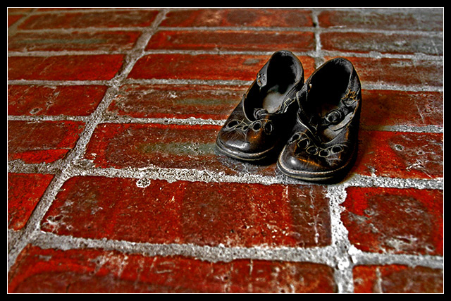
I like the simplicity, but on my screen the bricks look highly saturated. I also like how the shoes are offset and not centered. The black is a good contrast to the bright red of the bricks (again, could just be my monitor)
Nice colours, nice shoes with wonderful texture and wear and stories to tell (if only they could). love the contrast of them on the brick red and white mortar. Nice lines, nice composition. All nice.
I think this works well. The linear quality of the bricks and the rounded toes of the shoes are a nice contrasting shape. The deep red is appealing with the black shoes and the grayish grout. Simple and quite effective 8






 Add photograph to your favorites
 Add photographer to your favorites

 Photographer found comment helpful.


