Duplicate bg - paste as new layer
- Brightness & Contrast: (B +3, C +7)
Select window - promote to layer
- Brightness & Contrast: Clarify +5
Select front of sweatshirt - promote to layer
- Brightness & Contrast: HMS (0,0,-25)
Duplicate bg - paste as new layer
- clone out web strand in front of nose
- clone out stray hair on cheek
- Adjust:Photo Fix: Backlight +12
Select window layer
- Color Balance: RGB (0,0,0)
- Opacity +12
Merge all layers
Hue & Saturation: Colorize (B/W)
Brightness & Contrast: HMS (-20,0,0)
Neat Image Noise Reduction
"Powder" the nose - clone at 20% opacity, light burning
Clone stray hair from front of face
Clone stray hair from corner of eye
Clone part of dark spider egg sack off window
Brightness & Contrast: (B +2, C +3)
Resize
Borders
Sharpness: USM (.50,100,0)
Save as JPG
Statistics
Place: 92 out of 200 Avg (all users): 5.5817 Avg (commenters): 6.1000 Avg (participants): 5.4444 Avg (non-participants): 5.7015 Views since voting: 1025 Views during voting: 378 Votes: 251 Comments: 11 Favorites: 0
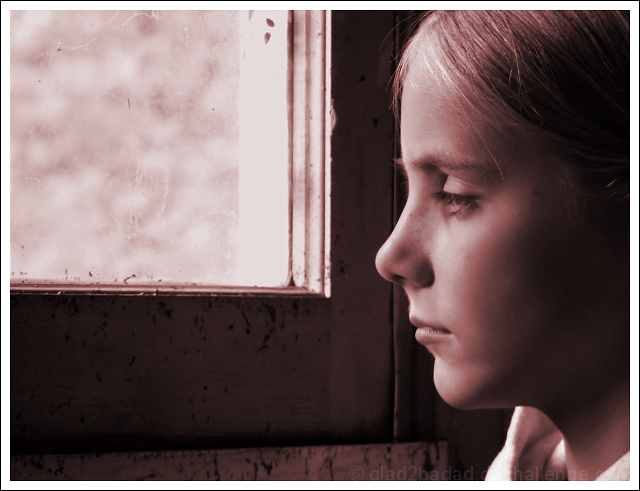
Add me to the list that doesn't like the red tones of the image. I think this is really my only complaint about the image as a whole. It's a personaly preference really, some will love it, others wont.
By looking at just the photo without the title, I wasn't able to guess the D and L. I had guessed Dark and Light.
Now, the image itself is great! (setting aside the red) Focus and clarity are really great. I love the textures of the window. The specks of dirtiness really do contrast the girl and it works.
The angle and framing/cropping are good too. I like how she is to the right of the photo staring out the left of the photo with the neg space being the window it works really well.
Light coming from the window is great on the girl and surroundings, however, looks a bit bright in the window itself. As I look at that further, I think that only adds to the image.
What I really think hurt this, is the color. Everything else is excellent. Great shot.
~Heather~
The red tones are not popular on this site, usually (i've found to my cost!) but I like this. The composition is nice and it is an original interpretation
The smooth tones of the girl's face compete with the specks on the window. Either adding noise to the entire image or cloning out the grit on the glass would have improved the image. The way that her nose lines up with the corner of the window makes the image feel somewhat off-balance.









 Add photograph to your favorites
 Add photographer to your favorites

 Photographer found comment helpful.


