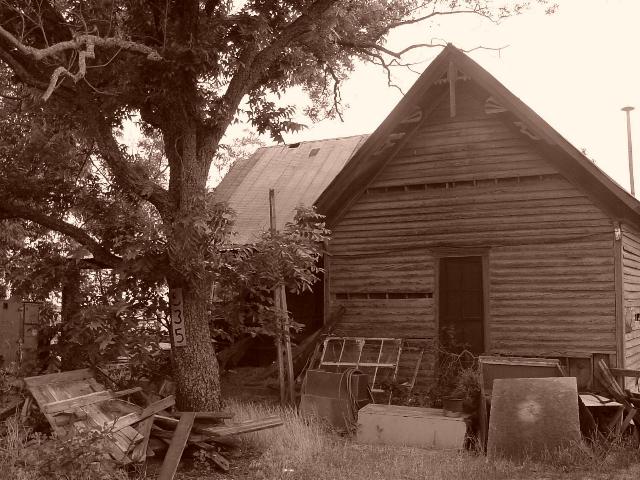
This is a nice subject to have portrayed in the sepia tone. The rustic nature of the home, coupled with the deteriorating artifacts work well. The lighting is ok, though might have been pushed just a bit dark.
I think the photo could have been improved the most by taking a more unique perspective. From the looks of it, this shot was probably taken standing up with the camera held at eye level. Unfortunately, 90% of photographs are taken from this vantage... and thus it quickly becomes this photo's disadvantage.
Try gettting a handful of different angles. Try shooting low, from the side. Maybe get one of those interesting objects, like a tire or something, in the foreground.
In short, adding a unique perspective that is something other than a typical standing-eye-view would add more interest to this already decent picture.
5. Fits the theme well enough, and there are no blatant 'you suck!' flaws to it, but neither does it really grab me for any reason at all. For reasons of composition, cropping, or subject choice, it's just a photo, and doesn't do especially much for me, aesthetically.
With a slightly different crop/shot angle, the tree might have been more central, and the shot as a whole more interesting. Or not. :->
This picture, although not without interest, relies too much on the sepia effect for it to 'work'. I'd have liked to see a more pronounced influx of light or a more diffuse one to create (or radically obscure) a pronounced tonal range. Without the flag post (?) and the right, perspective side of the building, the picture would gain impact. No real purpose I can see is served by inclusion.





 Add photograph to your favorites
 Add photographer to your favorites


