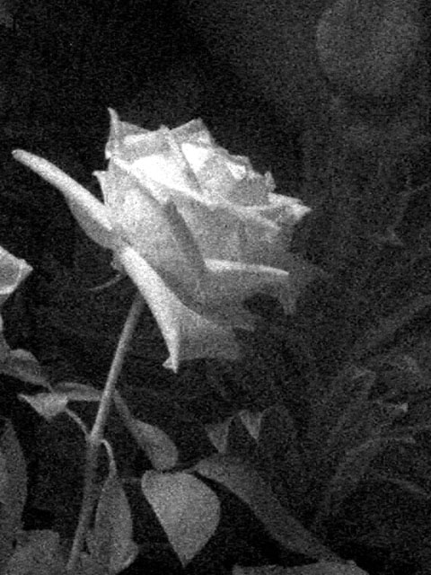
I'm afraid that the grain and the choice of toning just don't work well for me. Neither effect seems to do justice for the potential beauty of the subject matter.
I normally like grain in some images when used for impact, but I think the grain in this image is a little too excessive. I think this may have been better with a more plain background, or a textured one, but some of the leaves are little distracting - mostly the top right and on the left near the flower. More contrast and less grain on the petals would have really enhanced it more too.
I like the grainy look of this photo, although I'm curious why given that you didn't choose to go with sepia. It looks good in B&W, mind you; it's a nice shot, the flower stands out well from the background and it's a good angle. But I associate grainy with old, and therefore am more inclined to think sepia.
Interesting. The top area of the rose is a bit blown, which would not help with me prefering to see a bit more light on the rest of the shot, to bring out more lines and depth to the shot





 Add photograph to your favorites
 Add photographer to your favorites


 Photographer found comment helpful.


