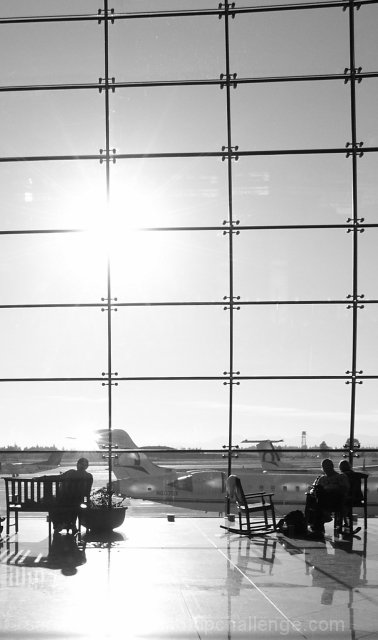
The title seems like a real stretch; I suspect that this would score much higher if the title didn't work against you. The fact that the cells in the grid aren't completely square is accentuated by the way you've cropped the image. Even if the windows really aren't rectangular I think that using perspective correction to make them so would have resulted in a more pleasing image. This is one of my favorite images in the challenge so far.
Stretching the rules a bit too much IMHO. The image itself is marginal. The sun is too bright and the added reflection on the floor makes the total image too bright.
This is a great idea for this challenge (first one I've seen). The photo has some blown-out areas, but it seems intentions and it work well. The thin border seems to wrap it all up. Nice work. 8
The blown out sense doesn't work too well for me. I like the placement and the silhouetted figures, but the bright light is just a tad too hot for my taste.




 Add photograph to your favorites
 Add photographer to your favorites

 Photographer found comment helpful.


