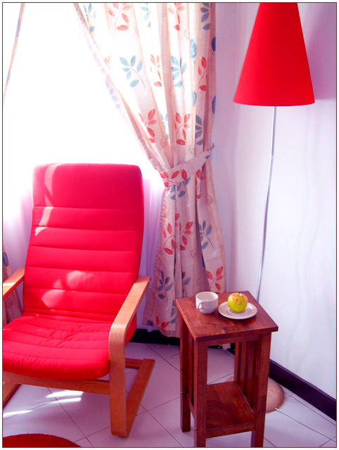
I like the use of color & lighting in this pic. I like the softness. Looks like it might be slightly blurry, but that may have been intentional I suppose.
5. Fits the theme well enough, and there are no blatant 'you suck!' flaws to it, but neither does it really grab me for any reason at all. For reasons of composition, cropping, or subject choice, it's just a photo, and doesn't do especially much for me, aesthetically.
It's not about any one particular thing in the frame, unfortunately, and the combination of bad focus everywhere but the table's contents and the oddly saturated color seem to distract rather than accentuating.







 Add photograph to your favorites
 Add photographer to your favorites


