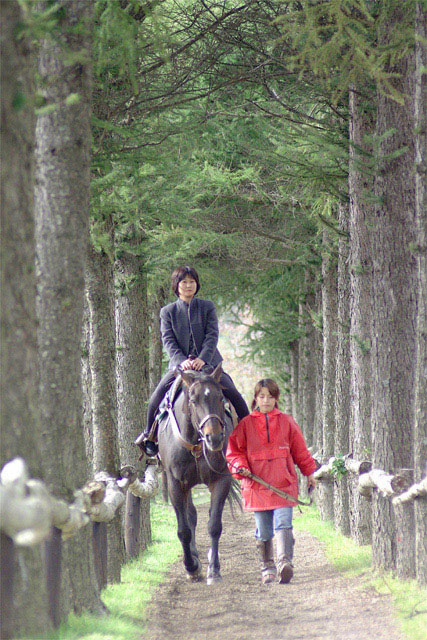
I like the feeling of closeness this picture has; however, I feel like if you had taken a step or two to the right, so the trees were symmetrical, it would have been better (in my opinion). The red jacket gives some nice color.
I only wish that you could have gotton rid of the fuzzy post on the left, otherwise a wondeful , and loving picture. It is one that gets the viewers attention and draws them back for another look, and is good enough to be displayed.
The colors seem a little dry here, but otherwise a very nice shot. The focus of the wood on the left is a little distracting - taking the shot from the center of the path might clear that up.
I love the composition and framing on this photo... the subject matter is also very interesting... I believe that the photo may be slightly over exposed... good work!
Great composition and framing... My only small complaint is that it seems a bit too bright. I think it would add a nice effect if it were darker with more pronounced shadows.
I like it. The colors feel a little washed out/too light. More important than that, however, I think it needs to be rotated a few degrees clockwise. Everybody's leaning a little to their right.
Technically, isn't this a trail? A very nice photo. Here is another instance where the resolution we are required to use hurts the detail of your shot. Generally, the closer you are to your subjects, the more distinct they appear. Higher resolution can keep more of that detail, FYI only, no score effect. Photo 9 Creativity 6 Road ?6? (pushing the envelope) total 7
Very nice. You might have been able to reduce exposure half or one stop and your picture would have a richer texture to it. I like the way the horizontal rails lead your eye to the subject.
Very nice. The railing on the left is a bit distracting. Would have been nice if you could have zoomed in just a little pass that or maybe stood more to the right.






 Add photograph to your favorites
 Add photographer to your favorites


