*Critique Club*
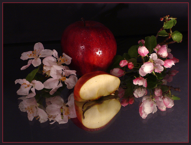
This is a very pleasant shot, which is what you were trying to accomplish, and that's good. It's peaceful and pretty.
Somthing is missing though, and I think that pedromarlinez actually gave you a helpful critique relating to the lighting, which I find to be off somehow.
The bottom half seems well lit and clear, but it gets dark. Almost creepy toward the top of the photo. The apple dissapears into the darkness and is consumed by the black. A little extra lighting could have helped this a little. Even if not a lot, I think that it needs just a tad more light. If glare and reflection were a problem, placing a thin cloth or paper between the subject and the light source would help to reduce that.
It looks like it was getting a bit harsh on the full apple, as there is a little bright spot there. Nothing huge, but still noticable.
The setup is really nice. I like how you have both the full apple and the cut apple. The apple blossoms are nice as well. really pretty.
Literal take on the challenge is nice. It's different anyway. Not the same old green lettering or sunglasses. lol
It seems that some didn't even get the reference to something from which something else originates. Apple originate from apple trees, and these flowers are from the trees. I get it.
It's hard for some people to see past there nose it seems.
Focus is alright it seems. Seems crisp in some places, and soft in some place. Kind of a nice mixture though. Dreamy. I really like the reflection. Wouldn't be the same without it.
~Heather~
I get what are you trying to say from the title not the photo itself. That means if you want to say 'something from which something else orginates', this is much like a still life photo.
Refreshing and original - your own interpretation. Lovely colors in a wholesome subject. Wish the back apple had more dimension (back-lit as well?) and the petals on the left would stand out even better with some back-light too.
I like the reflection. The image is a little dark and the cut apple is too central. Maybe if the items were more on the diagonal they might have more impact.
how did you light this? It looks like it might be with a single yellow spot. for some reason the light is very subdued, so your colors look flat. The black backdrop won't help because it's non-reflective, so using a diffuser (even a thin piece of paper) and a brighter light might help. That would also help with the hot spot on the apple. Filters can help with the flat color, but I find it's easier to do some post-process adjusting in photoshop or some equivalent.
Wow - a literal take on the theme! Very rare this week :). It's a nice shot, if staged - you get some credit just for daring to not take a pic of someone in shades this week!
I certainly can't fault your photo relating to the title, and from that, the theme. Good work.
An interesting way to approach the challenge. The image looks a little blurry to me, but I like the composition. I'd have cropped just a bit more off the bottom.





 Add photograph to your favorites
 Add photographer to your favorites

 Photographer found comment helpful.


