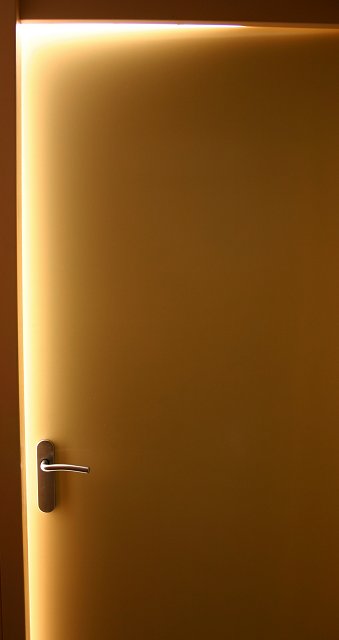
This image has great potential, but with it's tight crop and limited area, it loses the impact I think you were going for. I'm noticing alot of distortion on the door but it could be my monitor, That is usually a result of over desaturation, although the color of the door doesn't appear to have that problem. I think if this door were in a large room and you were able to get some distance and negative space around it, there would be plenty of impact with such a simple image. There's really nothing there to give it the POW factor that makes high placements in the challenges. The title is certainly appropriate, but with the ability to use advanced editing in this challenge, you didn't use all of the resources available to really make this an interesting image.
From looking at some of your other photos, I know you have a great eye for detail, so keep up the good work. I hope you found some of these suggestions helpful! All the best, Judy
It may just be the lack of context, but this image appears to have quite a bit of barrel distortion. The only substantial features in the image are the top edge of the door and the handle, and somehow their impact seems to be negated rather than accentuated by the emptiness which dominates the rest of the image. I can't identify anything that causes the minimalism to not work here, but I think that it would work better if the two features were closer together, reducing the amount of negative space which they have to offset.
Maybe a little too tight of a shot/crop. Find myself trying to get a frame of reference as to how open the door is...which takes away from the beauty (which is there) of the picture. I scored it a bit too low the first time, so I am bumping the score up....the shot is there and I do love the colors. Nice Job.
The simplicity of this shot is compelling. I can't believe I'm giving it such a high score for such a mundane subject. It just goes to show, that the mundane in the hands of an artist, can become art. Good job!
Cool idea and well executed except I wish you could have avoided the color band around the door where it transitions from light to dark. Still nice job.







 Add photograph to your favorites
 Add photographer to your favorites

 Photographer found comment helpful.


