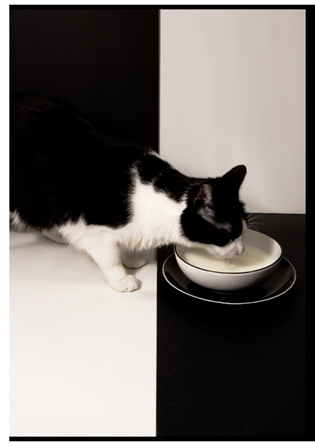
Purrfect subject for this challenge! ;^) The B/W is really cool with the cat. I think this could have done without a border...it's a little distracting and gets lost.
Well done on your top 10 finish, but I personally think its worthy of a top 3 finish. This photo is IMO the most original and well executed of the challenge and deservers a much better placing. The only (slight) draw back is that the cat looks a little soft, but not enough to detract over all. Great effort 9/10
I think this is so slick! You thought this out so well and were patient enough to pull it off. My preference would have been to crop off the black extended lines on the outer borders of the white rectangles. That would have been a perfect picture. As is, I gave you a 9, which places you in my top ten for the challenge.
nice use of b/w contrast. the cat gets a bit lost in the image, but i guess thats a little tough to avoid. one of the better ones I've seen in this challenge.. 7
This is one of my favorites in the challenge, but I really wish you hadn't added the border. It needlessly complicates an otherwise clean and powerful composition. 9
Love the checkered black and white back ground, the black and bowl/saucer, and the of so adorable black and white cat. Very well thought out. Good Luck
I really like this picture, one of the best. The black/white symmetry isn't perfect, but you did the best you culd with the cat's pattern. The only thing I don't understand is the border on three of four sides. Did you miss one side? 10.
Normally I don't like it when things blend into the background, but for this picture it kind of works. There are other pictures of cats drinking milk, but this one's a little more original and eyecatching. Great job.
The border hurts this and is actually a distraction. Especially being white on three side and blac on one, makes it look like a bad corp. Top right square needs to be the same shade of white as lower left.
I really admire your creativity and eye with this photo. The use of the B&W background is neat and very fitting with the B&W kitty etc. Just a couple of things that I think would improve this shot even better, IMO. 1 - I'd like to see the whites more white by getting rid of the slight yellow hue. 2 - The border. I don't really like the uneven lines. It is kind of distracting. score = 8
8 - Like this, like the frame, like the colors, like the 'style'. For me, even though the first thing I see is not 'milk/etc', my eye gets drawn there fast enough. Criticism; maybe, (though likely impossible seeing as the left top black background is likely 'wall') would like to see how this would have looked with the cat 'symmetried' over the top left black 'corner' (ie; diagonal). Otherwise, somehow more definition on the 'lapping' of the milk, and also on the white whiskers that are against the black right foreground.
I like the idea and the background. The cat disappearing completely into the black is a little disconcerting, but I'd have to see it the other way to know if it was better. 8.
What can I say?! Impeccably composed. Beautiful black and white. Wonderful!
On second thought, I might have moved the cat a bit up or down in the composition.
Excellent setup and black on white shot. Kitty looks like (he or she) is certainly enjoying the milk. Very well done. One of my favorites in the challenge. 10
Good use of black an white - I don't care as much for the black border around the white - it might have helped if you could have balance it to get better symmetry.
sadly, the very first thing I noticed was that the quarters were crooked and uneven. However, I loooooove the idea, and it is still a very interesting photo.






 Add photograph to your favorites
 Add photographer to your favorites


 Photographer found comment helpful.


