Author Thread Comments Made During the Challenge
Post actions
A little bit too plain! Nice idea!
Post actions
Very good technically but doesn't have the emotional impact I'm looking for in this challenge. 6
Post actions
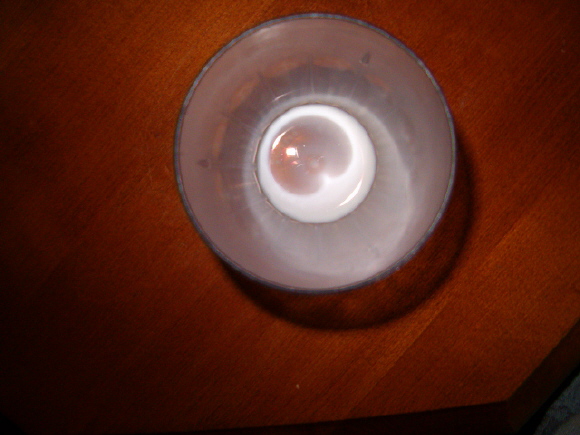
The right bottom corner can be cropped. And a little more soft illumination to avoid the dark parts and shadows.
Post actions
Post actions
Fit Challenge Criteria: 2/2
Post actions
nice idea i like how the ilk looks but alittle boring
Post actions
Post actions
cant understand why the table's edge is in the pic
Post actions
Post actions
Without knowledge of the topic, 'Dairy,' or the title, 'No More,' I would guess that this was an eyeball. The shortening of the depth of field is playing tricks on my eyes.
Post actions
The bit of floor you can see off in the bottom left hand corner is distracting as is the flash in the bottom of the glass.






 Add photograph to your favorites
 Add photographer to your favorites


 Photographer found comment helpful.

