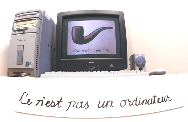
This photo is a play on a painting by René Magritte in which a painting of a pipe is telling the viewer they are not actually looking at a pipe, they are looking at the picture of a pipe.
Statistics
Place: 106 out of 140 Avg (all users): 4.2772 Avg (commenters): 5.5714 Avg (participants): 4.5195 Avg (non-participants): 4.1280 Views since voting: 1131 Votes: 202 Comments: 14 Favorites: 0
Et ceci n'est pas Marcel Duchamps. I like the idea here to use the surrealists to convey the Matrix concept - a lot more original than all those sunglasses and blue and red pills. However, i find the execution of your creative idea lacking. You didn't bother to rearrange your computer set up for this pose and it sets there, a bit clumsily for the picture, probably exactly as you always use it. The cardboard with the Ce n'est pas un ordinateur also sits there slightly awkwardly. I don't mean to come down so hard on you but the idea was excellent and you took the time to do the cardboard and approximate the font but then, unfortunately, you didn't take the time to do the real shot. 6
Big smile. Like the wide-angle shot, don't like the curve on the writing though that would have been so tricky to sort out! And the shadow line under the writing is also a pity. High-key is both helpful and probably necessary. The only shot that's touched on the philosophical antecedents of the film too, at least as far as I've seen in voting. wonder how many people will give it enough time? A couple of minor criticisms: the messiness of the computer - I mean the dark monitor surround, the white keyboard, the grey and pale blue CPU case, the label on the side - distract a little; and the text being off-set to one side of the computer also. Actually, the more I look the less I like the wide-angle image: doesn't add anything, in fact possibly detracts ...







 Add photograph to your favorites
 Add photographer to your favorites


 Photographer found comment helpful.


