Author Thread Comments Made During the Challenge
Post actions
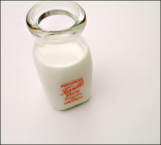
Great composition and lighting is too. Very classy. If it weren't for the room reflecting on the inside of the bottle, it would be right there at the top. 8
Post actions
Nice, but the reflections on the rim are distracting IMHO. 8
Post actions
not sure about the clipping at the top.
Post actions
The lighting is great in this photo and the milk is nice and white. The angle is kind of awkward to me, though. Perhaps if the top of the bottle was placed more in the corner and the top not cut off, it would look better to me. 8
Post actions
I wish the top of the bottle was all included. I think a different crop could make this even stronger.
Post actions
very authentic, glass jar and everything. may have looked better w/ a bolder background.
Post actions
Post actions
Excellent lighting in a high key image. The focus is spot on too. I like the minimal nature of the composition. 8
Post actions
This photo makes me thirsty. The milk jar is too high, though. Being able to see the top of the jar would make the photo more effective.
Post actions
i dunno but i like this pic plus all the photos that looked like this one
Post actions
Why did you cut off the top of the milk bottle?
Post actions
My eye is drawn to the rim of the bottle. The nearly centered placement of the contents bring my attention to the actual milk.
Post actions
Lighting is excellent (I'm jealous!), but there's something about the crop that's bugging me!
Post actions
Very Nice work. Is there a bit of red in the background?
Post actions
unique perspective, im wondering if its possible for you to get in closer with a wider angle to emphasize the the top of the bottle, also did you mean to cut off the top of the bottle? just curious.
Post actions
Simple, crisp and clean - I like the simplicity compared to others in the challenge. Well done.
Post actions
Composition not very good, but otherwise I like it.
Post actions
great picture - simple yet elegant! 8
Post actions
Nice shot ... if you hadn't cropped the top off the bottle.
Post actions
nice clean image here....GL
Post actions






 Add photograph to your favorites
 Add photographer to your favorites


 Photographer found comment helpful.


