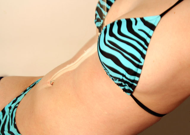
The composition is good, the placement of the model in the frame accentuates the midsection which I am assuming was your intention since that is where the milk is.
Background:
I don't think this background color works because it is to close to the model's skin color. Perhaps something darker would have worked better, it would have given the picture a bit more overall contrast.
My opinion:
To be honest, this picture doesn't really do much for me. To me, it doesn't really meet the challenge. I think that if you had used the theme "milk" in a bit more obvious way, this would have done better.
If you have any questions or comments about this critique please feel free to PM me.
i wish that the milk would have been a bit more visible. Seeing more of the milk actually spilling/pouring would have been nice to. Too bad there wasnt more of a difference of color between the body and the background.
I get how it's kind of dairy-related (because of the title) but I don't find it interesting. It's a little creative but if there was maybe a little more dairy, or if it fit more I would've scored higher.





 Add photograph to your favorites
 Add photographer to your favorites


