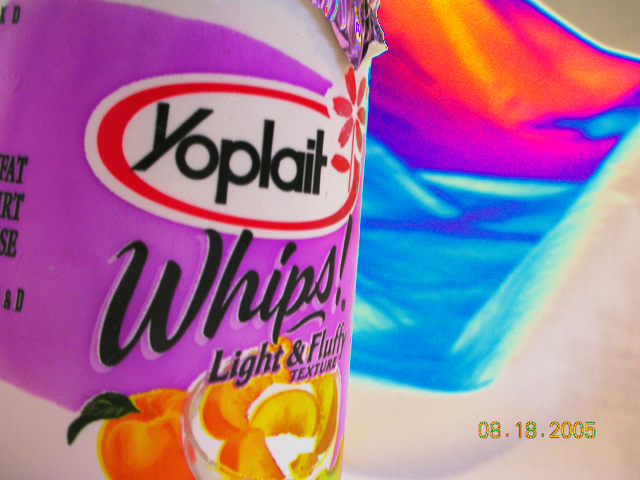
This would make a good advertisement picture, but, I think the picture would have fit the title better if you would have made the rainbow with more colors of yogurt instead of just a rainbow behind it. The border between the yogurt and the background makes it look blue-screened in place. Also, the date in the bottom right pulls you out of the picture completely.
I like the colors and the abstract feel to this picture. Could use a little better focus in the foreground. I probably would have cropped out part of the left side where the packaging information is written. Sadly, the time stamp is really going to kill you on scores. Make sure you turn that off on your camera next time. You have a nice eye...keep submitting.






 Add photograph to your favorites
 Add photographer to your favorites

 Photographer found comment helpful.


