This is only my second submission, was a last minute search for a good shot, not the greatest but ok. Would like any advice so please comment, good, bad or otherwise.
Statistics
Place: 230 out of 284 Avg (all users): 4.2879 Avg (commenters): 4.6250 Avg (participants): 4.1071 Avg (non-participants): 4.3896 Views since voting: 1123 Views during voting: 516 Votes: 389 Comments: 9 Favorites: 0
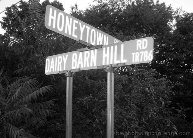
Let me start by saying this was a very unique take on the challenge. The challenge details state "Take a photograph where the subject relates to milk or milk products" and the lack of actual dairy products may have accounted for the relatively low score.
My immediate impression of the photo was that the sign posts are a bit overpowering and could have been avoided with a little tighter cropping on the sign. A few commenters mentioned the flat contrast which I tend to agree with, particularly in the lettering of the sign. The sign also seems to get a little lost in the busy background of trees and shrubbery. Perhaps a slightly different angle that does not include the trees (if possible) could help bring more attention to the sign itself. The power lines in the upper left corner of the image also tend to draw the eye away from the sign. This also could have also been avoided with a slightly different angle and/or cropping.
Personally I like the "out of the box" thinking that led to this image and overall I think it's a good photo that could be dramatically improved with a few minor adjustments.
I look forward to seeing more of your work and good luck in future challenges!






 Add photograph to your favorites
 Add photographer to your favorites

 Photographer found comment helpful.


