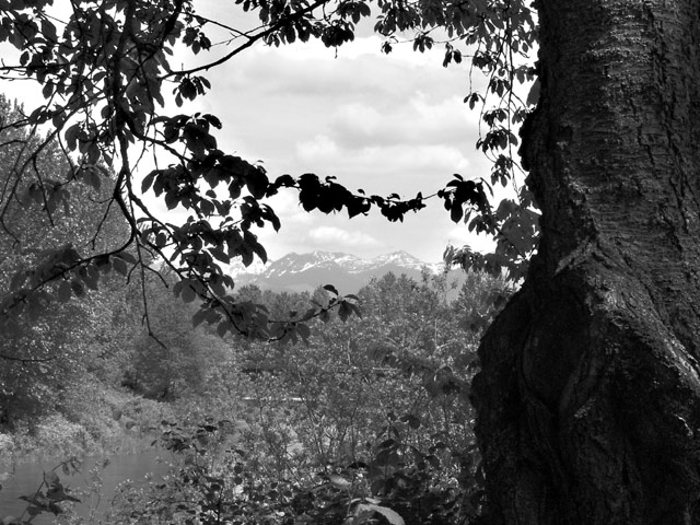
I appreciate the way you used the tree and specifically those branches to frame the mountain, but I think it's almost too much framing. This is also really busy -- my eye doesn't really know where to go. Apart from the silhouetted tree in the foregound, the rest of the shrubbery just kind of blends into this patterned gray -- I almost didn't even see the river at first. OK, so a lot of crtiticism with no suggestions... It's because I'm having a hard time coming up with any for this photo specifically. Everything I start to write has to do with taking another picture, and that's not fair. There's a good range of tones, the focus is good, etc etc etc, it just doesn't work for me. So, instead of running off at the mouth, I'd be happy to discuss it later after voting.
Nicely framed by the tree. Good contrast between sky and tree, mountains are great, however, the foreground lacks contrast. This may be a candidate for "color is better" (outside of this challenge of course...)
Sometimes framing a scenic image this way can work, but more attention needs to be paid to the placement of the frame. I find the leaves at center very intrusive. Additionally, including the black tree greatly reduced the ammount of contrast available to the rest of the image. I'd have tried for another location where I could get more of the river in the foreground, or gotten closer to the tree to push the frame out to the edges of the image.
This looks like a nice view :) The tree and the branches are nice ideas for framing this view as well. I think the tree trunk occupies a little too much of your frame though... Maybe about two or three steps closer with the camera? good work!





 Add photograph to your favorites
 Add photographer to your favorites


 Photographer found comment helpful.


