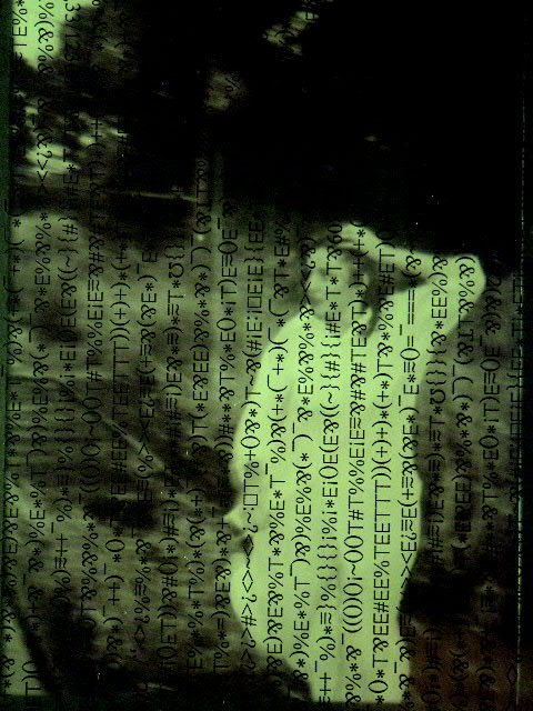
This was one of my 10s in the Matrix challenge (I voted even though I haven't seen the movies - I asked the kids what they were about). I must say I really like this photo, and I think it should have scored higher. I'm also wondering how it was done.
That said, here go the comments.
I think focus (on the typed stuff all over the picture) is very good. The out of focus background is great. Lighting is very good also. The colours are perfect. I'm finding little wrong here.
From what the kids have told me about the matrix, when I looked at it I thought, "Trapped in the Matrix", rather than "Escaping...". But then, I haven't seen the movies. From a photo point of view, the picture is nicely composed. I don't mind the slight slant in the text at all. I like the overall patterned appearance.
I don't think I'm being much help here. Sorry. You know, of the four pictures that you've entered, 3 have been favourites of mine in their respective challenges. Anyway. I think you'll take over the best photos for your camera page in no time. I'm looking forward to seeing more of your pictures. Take care,
Interesting. The typewriter overlay is a bit out of synch with the full matrix theme, but with no post processing, your options are limited, eh? Nice effect. 9 md
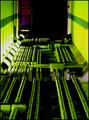
The slant on the text is SO annoying :-) - the more so for being so slight. Why did you do that? Can't see a reason for it ... other than that I like it a good deal - eespecially the 'other' photo.
What I like is the ephemeral quality underlying the scripted plane, blur, swaths and all. The green is as subtle as hues on an old Japanese triptych. Wonderful!
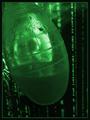
Something about this photo just doesn't work. It's too busy, maybe. I like your "confused" actor and the shot of the character garble is very clear. I think the smoke detracts from the shot. I would have lost the smoke and had the lighting be more direct or mainstream. Nice interpretation. I do like your choice of green in this picture. I kind of think she should be wearing black or at least pants. Nice job, though.





 Add photograph to your favorites
 Add photographer to your favorites

 Photographer found comment helpful.


