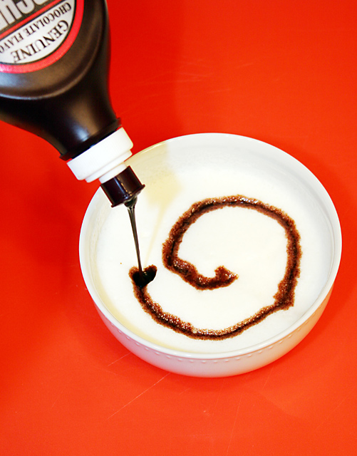
Had a hard time with the swirl. Couldn't come up with anything thick enough to actually make the chocolate swirl so used whipping cream. Took a little while w/the mixer to get it thick enough to be able to keep the chocolate from just dissolving. Thanks to my wife for not minding the messy kitchen (I'm not very good w/a mixer)
Statistics
Place: 103 out of 284 Avg (all users): 5.1805 Avg (commenters): 5.2778 Avg (participants): 4.9930 Avg (non-participants): 5.2852 Views since voting: 820 Views during voting: 539 Votes: 399 Comments: 20 Favorites: 1 (view)
Red competes with subject matter. Label is distracting too, especially since it is out of focus. Technical issues aside, It seems as though you put some thought into the leading lines. The eye tends to be drawn in by the bottle and follow the chocolate line.
The red and the white really pop with contrast, but the picture is kinda blah for me. The scratches in the table distract. Maybe if the focus was on the chocolate syrup botle?




 Add photograph to your favorites
 Add photographer to your favorites


 Photographer found comment helpful.


