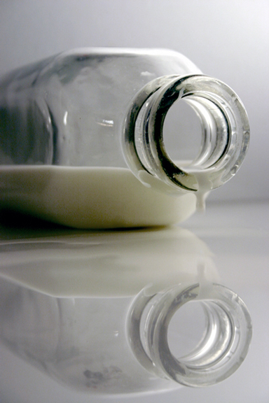
For me there's not enough seperation between the table, the background, and the bottle. I think it would have worked better with a colored tabletop. Everyting blends together just a little too much here. Also, the drip coming out of the bottle should be in focus, in my opinion.
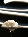
This is a fun one. Thanks for the originality! Must've been hard to light, wish the milk in the top half was a little bit more white, maybe not do-able.
Nice photo. Just my opinion, but I would like to see the images more centered in the shot. Either a tighter crop on top or extend the frame down a bit.
7 - Like this shot. Criticism; would like to see the focus on the drop. Also, possibly a little 'pool of milk', may have made this a better shot in my opinion.
I like this picture. Probably should have switched it to B&W to get rid of the yellowish hue at the bottom of the bottle. add: or maybe just desaturating the yellow. 7
Cute, the relection and the drop that *isn't* on the glass really do good things for this pic. I don't know waht effect a light under the bottom left would have done to the reflection, but the milk seems to have the potential to glow





 Add photograph to your favorites
 Add photographer to your favorites


 Photographer found comment helpful.


