I hope I can offer you some useful comments on your matrix entry.
Colour, Composition, Contrast:
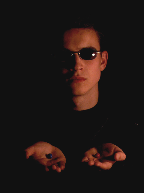
You were in tough company with the number of red/blue pill shots, but yours was one of the more bold compositions because you included a person in it.
The skin tones here seem a bit red, perhaps due to underexposure? I'll touch on lighting below, but here I will say that I like the placement of your subject and the hands open with a pill in each palm. I wish the pills were more visible, however, as they seem to get lose in the shape of the forward hand, maybe if they were tipped downward just a little more to better present the pills to the viewer? I like the mood created by your composition, however. I would not alter it too much. :)
Focus and lighting:
Here is where I think your shot could have benefitted from a little more work. Its a bit dark, though I really like that one side of your subject is fading into the black. I would have preferred a little more light on the lit side. I like the reflections on the glasses too though, it adds some interest to the face.
Overall:
This is a good shot that only needed a bit more lighting to bring out the expression of the shot! :)
whoa. IMO this really needs some black level adjustment to make the background black instead of grey. it's a nice use of light and dark tho. fits the challenge well.
Good image, good portrait in relation to the challenge. It might have been cool if you could have put just a bit more light on the hands to clearly show the red and blue pill significance but keeping the light on the face just as is. Overall i like the darkness and, much to my own loss in a prior submission, i do like dark images :) 8
The half shadow on the face is good, adds a nice mood, although the slight shine of the glass rim on the left appears in the shadow making it detached and thus distracting. I probably would have liked the shadow to be more centered down the face, or at least as far as removing the light flare on the left glass lens. In contrast, I think the hands and the pills needed more light. They are a little too dark and so do not stand out as well as they should seeing as they are the main focus - the choice. The mood is good, the composition is fine, I just feel the lighting could really bring out the best in the image.
Good picture, nice lighting effect. I can't help but think that it's a little too dark on the left side of his face though. No matter, I still rated it high cause it's just good. :)





 Add photograph to your favorites
 Add photographer to your favorites

 Photographer found comment helpful.


