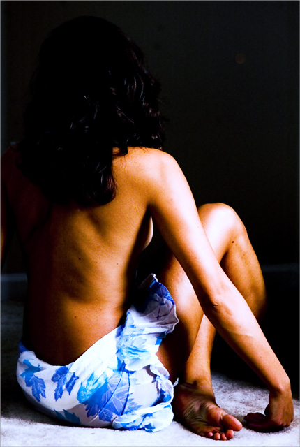
I wish there was a little light separating the hair from the background, and a little more diffused from the front right. Beauty, I'll agree with, but the within itself kind of lost me.
would have been much improved with more lighting bounced from the left on her hair so that it wasn't lost in the background and the line of her back would be just a bit more distinct. Otherwise, I like the hot lighting and the pose.
This could use some lighting in the hair, I can't really tell where the hair starts and the background ends. I think the lighting on the model looks great though.
I like the richness of the colors, but it looks like you applied too much contrast. The light seems a little too strong; the hightlights are blown out a little. The tltle doesn't make sense to me in relation to the image.
Her hair seems to dissapear with the background, maybe that was your idea. I like the contrast even though it is overdone. My personal taste I guess. The only thing that really bothers me is her hand. The way she has her arm almost looks chimp like? It doesn't look natural.
I like the pose but find the lighting to be too harsh and the focus to be a bit too soft. The soft focus doesn't seem to add to the smoothness of the skin. Was that your reason for using soft focus? Also, skin color is a bit too orangy. WB adjustment needed. Finally, I don't like how the right lower leg was just cut off by the light and just seems to be dangling there.
I think that the light was a bit harsh, and falls off too quickly here.. There are also a few pretty major spots on your camera lens or sensor that may be damaging your score as well this shot seems oversaturated. Either way, lovely pose and model, good luck.
Color seems a little harsh in the image but I really like the crop/composition and the POV. Her head fades into the background almost. 6 - good luck in the challenge!
Very good europeen feel to this picture. COlours are sharp both on the cloth and on the skin. Perharps a tiny bit overexposed and some light wash on the arm and leg. For the purpose of the shot, a lighter background could've helped, so would a framing. Nice work! 7
Beautiful.
I think backlighting the hair would have shown it against the black background. Currently on my well calibrated monitor, she looks headless.
Still love the overall lighting pose etc.
I like the pose of the model, though I think a second light source from the top left would help seperate her head from the black background and ease the harsh shadows a little. I think the colors look a little too contrasty; maybe the shot would look good in black and white too. Good composition and focus.
The only thing I dislike about this pic is the lighting. The light falling on the arm and leg needs to be softened a little (so the highlights aren't so blown), and this could really benefit from a bit of backlighting or a hairlight to separate her head from the background. I like the pose, and the skin tones are nice.
Good model and pose. Without being too lecherous, I think this photo would be better if it were lighter. As well accentuating her back, a lighter background would bring out her hair a little better.
this potentially could have been one of the top images for me - but the contrast is too start. I cannot see any detail in her hair, or where her head ends for the shadow, nor any detail on her arm for the brightness. The pose is great, it seems such a shame that i cannot see this image in its full glory.
nice lighting... only complaints is that the right leg seems to disappear unnaturally and it would also have been nice to have the head stand out more against the background.







 Add photograph to your favorites
 Add photographer to your favorites


 Photographer found comment helpful.


