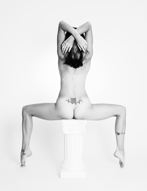
Great contrast between passive and active forces. The top being passive with high energy reaching down towards the dynamic lower torso. A wonderful presentation with impeccable taste of style. Congratulations on your top ten finish.
This was one of my very few 10's. Excellent shot, Soni. Tasteful and artful in many ways. I thought it would place higher, but still congrats on an excellent finish! :)
Thanks guys! I didn't want the pedistal to take away the focus of the young lady. I really like this shot and the artsy feel it has to it to me. Not only does her tatoos show art but her body form does to. Maybe not all of the voters got it. My favorite thing about this shot, is her left big toe. LOL
This pose reminds me of the photo on the cover of Guido Argentini's book Silvereye. Your model's pose from the waist down looks rather dynamic, while from the torso up she appears rather relaxed; I think that the composition would work better if there was a more dynamic element element in the top half of the image (e.g. a double exposure of her arms like this and with them reaching for the corners of the frame, or if her hair was being tossed by the wind). I like the tattoo on her lower back, but the ones on her legs throw off the balance somewhat.
This is a beautiful image. One of my favorites so far. The symmetry is nearly perfect. The pose is unique and interesting to look at. The tatoos are the extra touch that makes the whole thing. My only complaint is that the statue is almost completely blown out but that really dosen't hurt the picture. Easy to score an image of this calliber. 10
Very well executed. The symmetrical pose and the overall pose is just phenominal. I cants some looking from corner to corner. Excellent use of lighting. (10)
On of my top3 picks for this challenge. You're on luck soab, get to play with models like this! Great composition, color, tones, and what not. 10 And Congratulations with a ribbon :) Sonja? ;-)
Great photograph. Love the pose, B&W, composition and technical use of negative space and near high key lighting. It just lacks the bit of emotion or drama that my other top pics have. Got to make my personal distinctions, 8.
This is superb, the composition, exposure and the lighting have made this one of my top picks for the challenge. A very professional entry probably a ribbon. 10
Wow, I love the play with symmetry in this picture, it causes great impact. I like the lightnning, maybe a little overexposed, but it helps to isolate the model from the pillar; and the pose is superb!!.
Congrats! You deserve a ribbon.
The only thing keeping me from giving a higher score is the overexposure on the pedestal. I like the pose very much and the lighting on the model is perfect. Since the pedestal blends in so well, the photographer might have used one without the scrollwork and it wouldn't have been noticed as much. Those are my humble thoughts. I could never take a picture this good, so forgive me if this upsets you.
Would've preferrd to the subjects feet a bit more relaxed, mainly the left one, looks too forced and uncomfortable.
Also I wouldn've liked to see what she's sitting on to stand out a little more, not quite enough contrast there for my liking.. 9
After going over them all, Upping this to the 10, one of the top 3 IMO, good luck!
The technicals aspect of this image are all excellent. However, event though I recognise your creative effort, I personaly don't think this is the best way to present your model. I am still giving you a big 8 because your image is nonetheless breathtaking.
This image is growing on me, but it doesn't pop. My suggestions:
Even out the lighting. Right side is brighter than the left.
Brush/cut her hair. I just looks unkempt.
Do something with her hands. Spread fingers maybe? They are just hanging there like they aren't part of the shot.
Use a support item that either truly blends into the background or contrasts with it.
Great idea. To me, the image is lovely, but the primary subject being the body art, and the 2 on her shoulders being hidden by her hair makes it a distraction. I also think that a bit more detail in the pillar she's sitting on would only enhance the image.
Really interesting image. I really like the lighting in your pic. Composition are really great, too. Just a perfect image. Hope to see that in the top 3. 10, added to favs.
2nd. comment: after vote in all images, I have no doubt this is the best pic of this challenge in my honest opinion. Congrats for a perfect work.
The weakest of my four 8s. While it is ranked top 6 in my opinion, it lacks the wow factor the ribbon winners require.Something is not appealing about the pillar the model sits on. It is not completely ignored, nor it is standing out enough. I understand the idea of light/white, and I like it, but that pillar just swayed me from giving this a highest ranking in the challenge. Best of luck!
Classic shot. We never get tired of a shot like this when it is well executed. Great model for this pose too. I love the tatoos, they certainly add to the shot! good pose. Very nice B&W. In my tops. 8
Very nice. Good use of your models features in your composition. Coloumn / pedistal seems washed out though. It pulls my attention downward and away from the subject.
This is just Killer. Wonderful idea to sit on the column. Im sure it was rather uncomfortable sitting like this, but your model (or self) is in great shape so maybe it was easy. Art pure and simple. 10
The pose is nice, the tattoos help break up everything. I don't like that the pedastal blends in with the backdrop somewhat. I think I would have picked a darker backdrop for this. Lighting is almost dead on. Good luck.
I like the angles and most of the lighting, the right side is a little brighter than the left, which throws the absolute symmetry out for me. Other than that very nice image, very nice capture, and very well done.
The tattoos are a great addition (although I'm sure you didn't get them just for this shot, eh?) The high key image is well done. I like the pose too, elegant, but different.
My favorite of the challenge! The only undesireable thing I see is the dissapearing column which I feel barely takes away from the photo. Balancing an exposure as tricky as this is difficult, and I think you made the correct choice with it. nice work.
I love the simplicity and symmetry of this shot. The skin tones are excellent, the tatoos provide very nice focal points, and the smooth lighting really makes this shot top notch.
This photo definitely has my asking for more. If I could ask for anything, I'd like more details in the back and perhaps her arms a little further from her head. Other than that, she's build beautifully; too bad for the body "art".
Excellent shot. I like the symetry and the added balance created by the tatoos. It is a clean shot and intriguing all at the same time. Top 5 for sure. Goodluck!
i love that she is up on a pedicle. Only critique is that it may have helped to burn in the indentation on the left of her little seat to balance the lighting.






 Add photograph to your favorites
 Add photographer to your favorites

 Photographer found comment helpful.


