Challenge:Nude III (Advanced Editing IV) Camera:Canon EOS-20D Location: The Bat Cave Date: Aug 21, 2005 Aperture: 4.5 ISO: 200 Shutter: 1/60 Date Uploaded: Aug 21, 2005
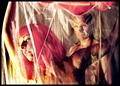
Nice shot. But, I think I would have toned down the lights a bit, and titled it 'Freedom' or something along those lines. The model seems to have a very care-free confidence. That helps this image a lot. Well done.
A little less light on your model's chest would allow the shadows to bring out her curves. The message conveyed by her pursed lips conflicts with the openness suggested by the position of her arms; a less restrained smile would go a long way. I'm not generally a fan of high-key photos, but aside from the lack of definition on her over-illuminated breasts you did a nice job lighting her; the catchlight is nicely done.
Great light splash effect. Facial expression is solid and the composition with hands reaching out give the image a special dlavor. Very well done. Bumping up.
brave pose. crop is a bit too tight on the bottom, I think - show a bit more of the abdomen and get the background pure white and this would be a really great picture. the idea is solid and the model is attractive.
Your model is beautiful, the facial expression is loaded with subtleties, but the breasts are so over exposed that the picture loses some of its appeal and impact.
A lot of wash-out at the bottom of the shot. The bright white draws the eye and is distracting. Also, either the model is wearing a nose ring, which is also distracting, or it's just a hot pixel. Critiques aside, It's a good shot. Like the composition and the pose. 8
I felt this was somewhat overexposed and flat. Needed some shadow to give her more shape. Center of chest is blown away by the light. I also think it would have worked better for me if her arms were not cut off. I would suggest bending them and linking her fingers behind her head. Good looking model.
Whitewash is right! the lower half of the photo is almost completely blown out, and there seems to be a blueish hue in the photo (probably caused from the flash) Her expression is great.
Perhaps a little too "whitewashed". I like her expression, that's beautiful. I'd also either include her whole breasts or cut them out. You cropped a bit off the bottom which leads to a lack of definition (exacerbated by the contrast)
The model has a "caught in the headlights" look to her. If dears could giggle at least. A little o harsh a light imho. It was fine for her face but her breasts are really washed out.
I just dont understand the pose here. Maybe just too centered. As for the concept of highlight or hi-key I think rethinking the lighting scheme would have enhanced it better. The shadows in the background are distracting. Kudos for getting a model to do the shoot.
not the most flattering photo of your subject. When I think of nudes I think soft sensual beautiful. I think the female body should be represented for its form . This is a little to direct for me. However, I do recognize that my opinion is just that and it doesn't make it right. I will take this into consideration when I voet.
I'm HIGHLY curious if this is a self portrait. If so, it's an extremely gutsy one. I like the high key, but think it went a bit high on her left side. Otherwise, aside from a slight lack of symmetry in the arms, and the nose ring causing a slight distraction, excellent job.
The light seems a little harsh and has washed out the highlights on her skin. Perhaps a different lighting strategy with multiple sources could alleviate the background shadow (if you really wanted to). I like the look in her eye and the expression on her face, a nice capture of her. Good luck.
I like the symetry in this image.
Unfortunately I find the overexposure of the torso hides all features, and makes the chest look too flat. Maybe if there was more lighting from the side it would help.
Apart from that I like the high key aspect ogf the image.
well done high key effect... my criticism would be that it seems more like a portrait than a study of the body, but then again the face is part of the body.
Very pretty. Maybe more even lighting would be nicer...just to even out the shadows on each side. Maybe get a little farther from the wall to eliminate that showod too. Colors are soft and pleasing, focus is good and you look confident. Good job.
Gorgeous face. Not a fan of the outstretched arms - makes me think she's tied up - she's not tied up is she? LOL Also a little too much "whitewash" - at least on the right side of the photo - could be a little more even. Good job and good luck.







 Add photograph to your favorites
 Add photographer to your favorites


