Not sure how this will do. Probably low 5's, but oh well, don't really want to expose myself too much. This is my first member's challenge so we'll see how it goes.
Post Processing: Layers, a bit of dodge & burn, a bit of cloning, nothing major, levels, contrast, resize, Reduce some noise, and save for web.
Statistics
Place: 57 out of 118 Avg (all users): 5.4143 Avg (commenters): 5.6047 Avg (participants): 5.0842 Avg (non-participants): 5.4937 Views since voting: 3178 Views during voting: 1229 Votes: 490 Comments: 45 Favorites: 1 (view)
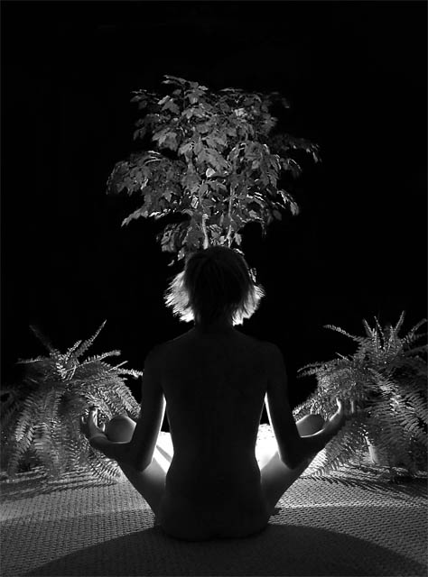
flower growing out of her head is very distracting. Would have been quite nice without it - unless, of course that was the point and I completely missed it.
The composition is well balanced, but the lighting doesn't create adequate separation between your model's head and the tree in the background. Omitting the ferns (or moving them to the foreground, behind the model) and moving the camera so that the model occupies the bottom 2/3rds of right corner and the tree fills the top 2/3rds of the left corner would preserve the balance and eliminate the appearance of having a tree growing from her head. Nice use of B&W to highlight the textures.
great idea. I wish I could see *some* detail on the figure--maybe a small fill light to at least lighten the grey and make the outline stand out more against the dark background.
Looks like the leaves in the middle are sprouting out of her head. Not very attractive to me and not very "nude" either, so I wouldn't be surprised if you got a pretty low score with this. If you'd at least shown her from the side or added a little light for her back, this may have done a lot better than it will as it is - just my guess.
LOL The first thing that I thought when I saw this shot was 'Ow, isn't that hot in the crotch!' :-P I like how the lighting being in the center of the compostion effects each part of the shot because if the lights direction!
TC
I love the concept, but you kind of lose me on the execution. At first glance, this looks like she's got one of those head things on, like the dancers in Las Vegas wear on their heads. I find it difficult to try to separate her figure from all the bushes that seem to be growing out of her head and knees. Bottom line for me is that the cluttered background and the textured floor draw my eyes away from the model.
I really like the idea of this shot, but I find the tree growing out of the top of the head way too distracting. Took me a minute scrolling down to know what I was looking at.
This is interesting and it looks peaceful. I don't think the tree adds much but it looks as if the photographer had a purpose for it and I'm just to dumb to get it.
I like the lighting very much, the silhouette of the torso and head is very nice. I like the use of all shades. I'm not sure about the tree from the head though, I'm going to have to think about that. Overall nicely done.
Composition idea is interested, if only perharps overdone. symetrical aspect is a nice touch, so is the lighting. I wouldn've wished for better control of the sharpness, or perharps some softness. A frame would help this shot. 6
This is a very unusual shot. I can't say that I don't like it - because I do. I think the B/W works well. It reminds me of Carmen Miranda though, with the illusion of the headdress. Still, a nice piece with graceful lines.
I don't think that you can fully portray the term "nude" when using Silhouettes. It's a neat image, one that I think would have worked better in color. Good luck.
I am sorry but this photo strikes me funny, I feel like she is a cheerleader from vegas, with her pom-poms and her headdress. I hope I didn't offend you or your model. I am not trying to. I just feel that you should not place your subject where it looks like things are growing out of her head and hands. If this is intentional I appologize.
I find the plants distracting, especially the one growing out of het head. I takes all attention away from the meditation. I think of a clean and simple, restful image when I think of meditation.
Took me awhile to figure out what I was looking at. Interesting, but she blends in too much - makes this look like a picture of three plants. Camera was placed 180° from where it should be, IMO. Good effort / creative concept though.






 Add photograph to your favorites
 Add photographer to your favorites


 Photographer found comment helpful.


