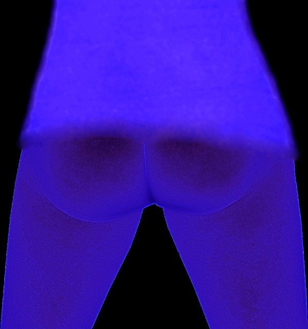
Challenge:Nude III (Advanced Editing IV) Camera:Gateway DC-T50 Location: Studio/Office, Buchanan, VA Date: Aug 21, 2005 Aperture: 1:3.5 ISO: 200 Shutter: 1/50 sec Galleries:Nude, Studio Date Uploaded: Aug 21, 2005
Crop
Selective layers of background & model
Faded out background layer to white (added flash maxed out highlights, shadows, midtones)
Spot editing (blending brush & smart erase) to eliminate blemishes on skin
Layed out more flattering lines/curves of model's body and used shrink tool to conform the subject to those lines
Neat Image
Blending brush to smooth lines of clothing
Changed image to Negative
Added filter = Glow: Neon
Adjusted curves
Saved for Web
Post Challenge
Okay, for those of you out there wondering... Yes, this is me. I used the outline and shrinkage filter tools/brushes to make my actual body more "appealing" to the masses - although I obviously neglected something in the translation based on my score and comments - LOL. I've posted an outtake that I think would have done much better (based on feedback I've gotten post-challenge). It's all about mod-70s extremes. And yes, I was trying to emulate some of the posters from that era - unfortunately, I fell very painfully short of achieving those goals. And yes, I completely understand the negative comments I've received - you were basically right on the mark (I wasn't).
I hope to learn a lot from the experience and move on - that's the best we can do, right?!? I promise not to subject the general public to this form of abuse in the future!!! ROFL (It'll be a completely new format next time!)
Statistics
Place: 109 out of 118 Avg (all users): 3.9591 Avg (commenters): 3.8889 Avg (participants): 3.4624 Avg (non-participants): 4.0758 Views since voting: 6780 Views during voting: 1260 Votes: 489 Comments: 42 Favorites: 0
And for the record, I thought the processing on this was quite interesting and certainly gave a different impression on the challenge. The pose, I don't know about the shrink tool, don't have that in PI, but to go with the title it is perfect. The shirt gives the exact impression of a 'teddy' or short top on woman (no, not saying you are feminine looking) getting ready to reveal all. I suffer from the same fate with a lot of my shots - original thinking gets squashed.
And, no I'm not disclosing whether or not this was me! ;-)
But you did exactly that! I meant to point this out a long time ago but got sidetracked by other images in your portfolio and never got back to it. Don't feel bad, at least you disguised your butt. I let mine hang out unedited.
Well, this obviously didn't pan out the way I had hoped, BUT (pun intended) I did learn quite a few things... LOL Shoulda gone with my 2nd choice (or better yet, passed on this challenge). Live and learn! At least I got a LOT of interesting comments and suggestions. And, no I'm not disclosing whether or not this was me! ;-) Cheers & on to the next challenge!
42 ones???!!!! - Well I liked this pic. I wish I thought outside the box more often myself and was more creative with PS. Also thought it would make a great poster.
First thought: there is something around the outline that, I feel, was caused during post. It isn't good to look at.
Second thought: Sorry, this is pretty harsh, but why would the photographer ruin such a sweet booty with such a treatment? I just don't get it.
Interesting to say the least. As long as the model is hiding behind the processing, why not lose the shirt. Note: there is nothing wrong the post processing, I just wondered.
I'm afraid the processing here doesn't grab me at all. It makes me wonder whether a nearby nuclear reactor may have exploded, and she's trying to escape, or something :/
Not sure what to say about this picture... colours are sad, composition is non-existant. A frame could do some good on this shot. No emotion or interest at all in this shot, sorry. 4
I really like the Idea here, but this image looks overly processed, and heavily photoshopped, and doesn't give me much that makes me really get anything from this.
I like the crop and angles. I'm still deciding on this shot, the non-crisp edges from the shirt are what I'm debating about. I've got days to decide --- reserving final judgement for now. Overall a very interesting image.
I don't know what to say except that I see nothing good in this image. Even as an abstract, it falls flat. Looks like someone went crazy with the blur brush also. Sorry I can't be more positive. Only suggestion I could make is that the composition would be good if it were a plain color or BW, not-so-processed shot.
really really wierd imo... i think this has left the realm of photography. For constructive critism i would say try something completely different in your post processing.






 Add photograph to your favorites
 Add photographer to your favorites

 Photographer found comment helpful.


