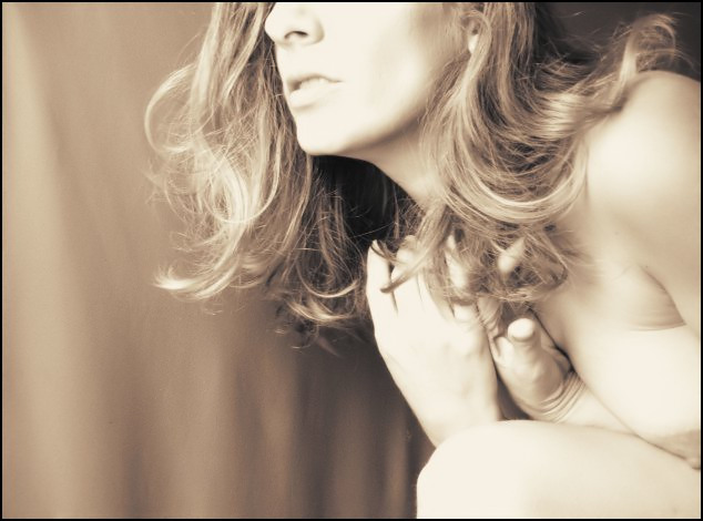
i think its her expression that makes me love this photo so much. normally i wouldn't be a fan of the low contrast and overexposure, but she makes it work, and the composition is perfect.
This is a superb titilating image which I presume was your intention. Lovely soft exposure and the duotone really is lovely. The composition and focus are perfect too. Great work. 10
I love the color treatment, and the high-key look, but overall the image looks a little washed out to me. I like the general concept here, but feel that it would have been much more sensual if she had her arm wrapped around her breast so that it was more hidden. She appears to be in a "self-protective" position, and, in my mind, to have her breast hanging out like that just doesn't fit with her body position.
Tthe model's expression looks a little uncomfortable. I do like the tones in this entry, except I think it is masking some really beautifuly colored hair.
a little too blown out in the highlights. the creases in the wrist and above the breast make the pose seem forced (not to mention the expression). the image says "don't look at me" a lot louder than "look at me".
I really like the subtle tones going on in this shot. I normally like higher contrast, but I think this works well. Some might not like all the blown out areas on the model's skin, but I think it is quite interesting. I like her pose and facial expression. Her hair looks great too. Her hands look a little awkward, but are not a big deal.
I like the soft look and tonal range used. The slightly overdone highlights make this image work. Nice crop and composition. I'm wondering what she's doing and what she's looking at, I like the mystery. Very well done.
Nice teaser. I love the expression on the model and the title is very appropriate. Overall a great capture. The highlights on the hand and face seem a little blown, and the focus just a touch soft.
For some reason this shot stands out for me. I think it may be the composition. The look on the face (what there is of it), the way her hair is falling and the position of the model in the shot is very alluring. Somethings I might change would be to crop a little more of the left side and while I like the brightness of the photo, I think it might be a little overdone especially on the face and hands. But overall, this is a very appealling photo. 7
The lighting is a little harsh, and if the model was further from the background so it could be more out of focus, the folds in the cloth wouldn't stand out so much. Still nice image.
The pose and the expression make this image. I think the soft focus works very well. Love the tones and the 'overly brightness' (voters will call them blown hightlights - I disagree). Very well done. 8, may bump later. bump to 9
Her hands are posed wonderfully and she looks like a lovely model. I feel as if this was supposed to be a high key photo. To me, it looks washed out and overexposed. It could be my monitor but I do check the greyscale often. The crop, to me is to tight. Since most of her face is shown, it would be nice to see her eyes also. Her nipple is really close to being cut off. With a more generous crop and deeper outline shadows this would have been a great picture.
hmmm - this really looks like it could have been a great image, but you squished and contorted your breast and cut off the top of your head. The head is forgivable, but the breast...;-) Points for other aspects though and for bravery.






 Add photograph to your favorites
 Add photographer to your favorites

 Photographer found comment helpful.


