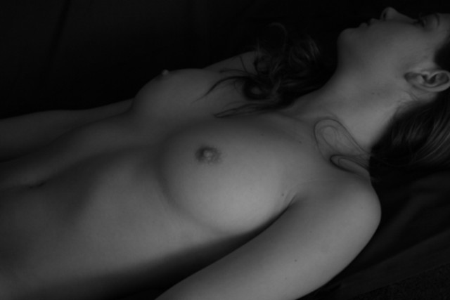
Really like this shot. The only blemish IMO is the hair resting on the left part of the neck. Wish it were a little more "posed" or "placed" if that makes sense!
it appears that the monitor you edited the pic on is too dark...
old monitors tend to be too dark.
try pushing up the brightness on your monitor and see what happens?
Good luck and congrats on your first challenge entry ;)
i was pretty happy with my scores on my first challenge pic so thank you everyone and thank you for the helpful comments, i'm learning so much! Something that confused me a little is that when i posted this pic from my computer it was very dark with only the right breast visible through a shaft of light and when i read some of the comments i wondered why ppl were saying that her eyes appeared to be open if they couldn't see them? So i looked at the pic on a friends computer and too my suprise it appeared completely different-the whole pic was light and my light shaft was non existant! Dunno if anyone can help me and tell me what happened, i'm not that computer literate to be able to understand how this happened?!
You've ended up with a rather flat B&W photo here from a good potential shot, I think some level tweaking in Post Production was called for or better lighting.
what a lovely pic, it just seems a little flat, lacking something... wish i could tell what. You get the benefit, though, any one that posted a real nude must get a good score.
Revisiting and bumping up. This is a real good pic in every respect.
It looks like her eyes are open.:) I am not sure this is Nude challenge material. I agree that it is a nude photo, But I am wondering if it is "punchy" enough. I wish you the best of luck.
Good range of tones...model looks too shy, not facing more toward camera, but I had same problem with my model, can't fault photographer for that :) ... 7
LOVELY. great model, very excellent pose. I think much like my submission, the lighting is a bit blah, and the hair on the near side of her neck is slightly more whispy than I would have let sit, but it's a good touch.
I think a little more contrast (or maybe a little brightening of the the skin tones) would add a zing to this image. Maybe a different position of the neck/head and or the arms, just to give a slightly more natural look to the pose. I like the lighting and how the shadows work with the very dark bg. Well done!
i must have cruised by this photo the first time - this is actually quite nice. The lighting is simplistic, as is the pose, but it has a sort of 'sleeping beauty' mood to it which i like.
I like the use of the strong diagonal here. The skin tones look great, and the head turning slightly away shows just enough features to hold some interest. I wonder if the addition of something small could boost the impact of the shot a little. Maybe if her hand lay across her stomach and she had a ring on, or maybe an ear ring that remained in color as the rest of the image was b/w. The attractive model never hurts either, good shot.
I enjoy low key work, but I'd like to see at least half of her face. Also from what I can see, the pose looks too stiff, and brings a sense of awkwardness (which is expected with this kind of photograph, at least to folks who dont do this regularly). Next time, a different pose, something more sensual, and show a little face, and you'll have a wonderful photo.
Great intimacy portrayed here.
nice photo. Lighting seems to work ok. Maybe cropping a bit further to the right so the ear wasn't chopped would have been better.
Beautiful model, she just looks VERY uncomfortable.
She is clearly awake. The pose looks very stiff and awkward and the image as a whole is too low contrast.
"while you were sleeping" your husband took this photo of you and entered it in a challenge where it will be permanently on display on the internet. LOL
I sure hope that's not the case. Beautiful woman. The lighting is a little dark, but good. The pose doesn't do much for the image though. Overall good job.






 Add photograph to your favorites
 Add photographer to your favorites

 Photographer found comment helpful.


