I'm sorry. I don't get the message of this one.
Edit to add more:
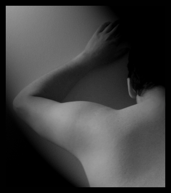
The low contrast makes the photo look muddy. Whatever caused the two areas of darkenss should have been eliminated as they make the overall presentation confusing. To me, it looks as if a gradient filter was added and not reduced enough in opacity.
A bit flat, and very cold. You could add contrast with curves or levels, and a hue / saturation layer set to colorize with an orange tone and reduced opacity could warm this up a bit. I feel it would improve this image, but this is a very personal judgement and depending on the mood you were going for, you may not agree.
Very interesting photo. I like the contrast between the dark on the upper right / lower left and the bg and skin of the model. The angle of the arm complements the dark bands as well. Nice lighting too. Well done.
I like the lighting and the softness of this photo, but I don't really like the grainy effect. I don't know how well this will do. I don't think there is enough nude for this challenge. Good luck.
this image doesnt really give me any sort of reaction.. just seems really grey and sort of uninteresting. imo the vignetting in the lower left and upper right seems odd, the pose is slightly uninspiring, and the lighting is on the weak side.






 Add photograph to your favorites
 Add photographer to your favorites


 Photographer found comment helpful.


