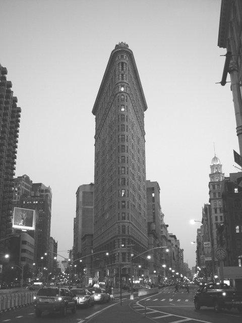
Great subject - recalls the classic takes on this unique building. The billboard, cars, lights, encroaching bldg at URHC detract, though. Maybe getting closer and shooting up would minimize these nits.
this is good. If I could change anything, would crop out buildings on each side and darken this up - looks like a drizzly day instead of perhaps dusk. good job.
I like the way the buildings on the left and right form a "frame" and I like the way the middle building has upward motion about it. I feel like it should have been taken from just a hair or two to the left, but I imagine that would have put you in the middle of a road (not a good thing).
The photo seems washed out -- I'm not sure if it's a misty day, or if that's just your camera. Either way, I'd try to push the levels apart a little further, so the image has higher contrast. Great use of symmetry.
I can't really put my finger on the exposure problem with this photo but it looks a little strange... I believe it's a touch over exposed.. I think i would also like it better with the tall buildings on the right and the left cropped out...







 Add photograph to your favorites
 Add photographer to your favorites


