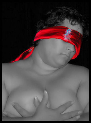
I liked this photo and the way the woman looks so real... The only thing I didn't like is the red stole... or how you call it? (I'm hispanic) It's a good concept to put the red stole though, but I don't know... it doesn't "match" the picture... looks too agressive... I'd rather see the whole pic in b&w... but pf course... it's only my humbble opinion :)
Is this you? Whether it is or not, I must reiterate what I said before... This is a GREAT shot. VERY underrated in my personal opinion (I scored it an 8). I love the fact that the blindfold is the "color" of sin - red and that it hides the model's face from the perceived "sin" of the shot. I just thought this spoke on so many levels, it was extremely well thought-out and presented. I have to agree that the lighting is really the only short-coming of the shot. I wasn't exactly sure what it was keeping me from scoring it a 10, but that's it. Maybe a tad bit more contrast and dodge/burn brush (although I'm not trying to sound like a preacher for Heida and/or Joey - although I truly admire their talents!). This was a seriously great shot - took a lot of courage and fortitude to stick by, but in my humble opinion any qualms about it were shallow minds and the far too accepted anorexic viewpoint of beauty. In all honesty, it reminded me of a modern-day Renoir.
I really like this photo. I like the red blindfold. I think the only thing that I would have changed is a light in the hair to make it stand out better. Good luck in the challenge.
IMO, the red blindfold would have been better had it not shown the blue stitching. The random splash of color takes away from the overall effect. Otherwise, good shot!
Oh please, not ANOTHER uncreative use of selective desat. Sorry, but I've definitely seen too many of these on this site. Yours is about the 7th picture I rate and the third I comment on in this challenge. Sorry, I really don't care for this too much. Composition is a bit lame, title even more so. The shot is technically weak, in my perception, either soft or pixelated or overcompressed.
No offense, please, I'm just giving you my honest feedback. I don't care for the "nice" comments that don't tell me why people do or don't like my shots, so I treat others' work the same way.
Love the light . Different and interesting. Yes, I beleive I do like it. You might want to experiment with different bandannas, white or black might look even better and keep the attention on the overall photo.
There is something very mysterious and naughty about the red silk blindfold. Great use of selective desat. The model appears so soft and innocent against the bold and brazen red blindfold. Very nice job. Bumping up.
The picture seems of very poor quality, due to grain and confinment. The frame doesn't work very well because of the black top portion of the shot, where we don't actually see the frame. The desaturation of the whole shot except the eyeband is a nice touch, but i feel the colour is too rich and doesn't quite work properly. A wider composition could've helped here. Nice job non the less. 5
I think she has an angelic face and her form looks to be plush or maybe ripe would be a better word. It looks like she is peeking out at me from her blindfold. sorta gives me a creepy feeling. The lighting could be better at giving definition to those lush curves and the red seems to me to be oversaturated.
I don't like the selective desat, especially since the blindfold is almost over saturated. That being said, the rest is just a bit soft, and hard to really see any detail.
This one is a little unsettling. The pose is very disturbing.... very cold and reminds me of something you would see in a movie.... maybe woman captured and being held for ransome by a serial killer. The selective desat doesn't really help.
I'm thinking the scarlet letter here but I don't believe the over saturation helps with this image as the rest of the tones are a little flat. However, the red aside, I like the composition. The skin is rendered well. 6 - good luck in the challenge!
This is one of the few images here making a statement.
Lighting is great. the red is perhaps a little bright, but the selective desat works well.
Image is overall a little soft.
Interesting choice of using desat to emphasize the blindfold. Love the lines and curves created by the body, and the hands are placed perfectly to convey 'protectiveness' over the breasts.
That bright scarf amidst the blurred underexposed body doesn't work too well for my taste. I'd make the whole thing black and white and then really work with the light and dark for more detailing.
I like the desaturated feel but at the same time the color of her lips is too in line with her skin tone and she is too blurred for my taste. Otherwise I really dig this shot and feel like it speaks volumes for most of women kind in the Western World.





 Add photograph to your favorites
 Add photographer to your favorites

 Photographer found comment helpful.


