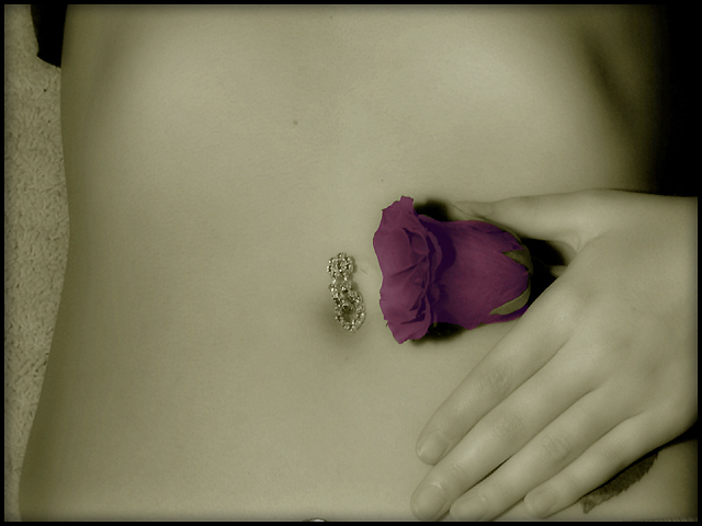
Usually, I don't like a greenish cast with skin-tones, but I like it with the rose and bit of stem. A different color background would add a bit more separation between it and the model. The dark patch in the upper-left is a bit distracting.
Very simple yet artistic. The color here is very nice. I think the carpet on the left is a little distracting, I would like it better on a smooth surface.
There are several minor things which you could do to move this good photo up a few notches.
- Watch the edges of the frame; the model's fingertips are cut off and the edge of her pants/shirt are visible.
- Use only backgrounds which complement the subject. The lace background is busy enough to draw my attention but doesn't contrast strongly enough to complement the smooth texture of the skin.
I'm not sure how well I like the jewelry in the picture, but I think that the navel would be easier to identify if it weren't so covered up.
I think everything's great except for the belly button jewelry. The way the hand covers up the leaf as if its hiding a forbidden tattoo is neat (don't know if that was intentional or not, but it really works). And I really like the touch of color.
This is nice. I really like the saturation of this photo. I hop it does well, in this challenge. good luck.Not sure what the thing at the bottom is but it is just a tad distracting. It is about 1 inch to the left of the middle finger.
I like the selective coloring on this, it gives it kind of a "victorian" look, and it has a nice sensual feel The left side of the image is a bit distracting to me - the texture of the carpet, and the bit of black (that looks like it could be her shirt) spoil the otherwise soft, sensual look of the image. The composition could be a bit more dynamic, with the jewel and rose being somewhere other than nearly dead center.
I love the hand, and navel, I think a tighter crop to hide the fabric in the upper left hand corner and the carpet along the left might have raised your score with me. Good luck.
Nice nude. The flower is a bit muted for my tastes. I would have liked to seen this as a black and white as opposed to the sepia look (but I'm rather new to all this, and just my newbie opinion).
I like the curve and the use of selective desat. The lighting is perfect. I find the bg fabric to be distracting, I think a dark/black bg might do it for me. Good job and good luck!
very american beauty. My first impression was that the image was out of focus, but on closer viewing the see the navel jewelery and the rose are crisp. I do not care for the greenish tint, it is not becoming of a belly.
This is nice but the left side background and the dark thing up top are a slight distraction. I love the desat and bringing the rose back into color. Good work!
nice attempt. it seems the hand could be a bit more relaxed (and you probably could have stood not to have cropped off the finger tips). the background on the left is fairly distracting--that should have been blurred into something smooth. also could have offered just a bit more than the torso (not a lot, just a bit).
I love the select desat and soft lighting. The only drawbacks are the carpet in the background and you can see a little of the models shirt in the upper left corner.
One of my favorite shots in the challenge, I love the softness, it just has a very mellow feel for me, the only thing I would change is to try to have her fingers looking more relaxed. Good luck.
Interesting lighting and color management choices. It looks as if the model has good skin tone. I think the lighting could have been arranged to give more modeling to the shape. To me, it looks to flat. The carpet and close crop of the fingers are a bit unfortunate also.
Very nice image...Really like the softness and desaturation decision...gives it a nice feel. Only negative that will impact this image is the distraction of the rug? (or floor) to the left. A black cloth background would have accentuated her outline and provided some symetry to the shadows to the right...or you could have cropped to exclude the floor. Good Luck.






 Add photograph to your favorites
 Add photographer to your favorites

 Photographer found comment helpful.


