Very brave and lovely capture. Obviously someones beloved. The shirt and her pose are classic and the way you have darkened her face shows respect. Love it. One of my challenge favorites. 10.
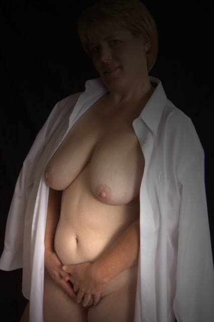
I like the idea of a shirt as a prop in this shot, though it doesn't add much with how it is used here. The lighting is ok, but I think that a different lighting setup could really pump up this shot. Maybe place the light source behind the model's left shoulder and create a backlit shot with some interesting rim lighting. The composition is ok, though doesn't add any interest to the shot in itself.
I like the softness and the tones in this image but I think the lighting needs work. A more defuse, all over glow would have really enhanced the image. Crop/composition works.
This is very brave, not just on the model's part, but also on the photographer's, because it does not even attempt to be a typical 'artistic' nude pose (you know the kind; with the dramatically extended limbs and the artfully twisted torso - I believe painters call it a 'figure study'). Anyway, to return to YOUR work, I'd call it a success. Unpretentious but nonetheless very effective. The shirt gives it purpose and interest, while the model's slightly reticent and barely visible facial expression gives it charm. 9
The fact that the woman's making eye contact with the camera gives the photo an intimate feeling which contrasts with the self-conscious placement of the hands. Looking dreamily away from the camera or finding a more natural-looking way of holding your hands would have improved the image. Shining a light at the back of the model's head would help to add balance to the scene's light.
Very tastfully done. Beautiful skin tones and I like the the men's skirt over the shoulders. I find that the placement of the hands a little ackward, however. Since that is a part of the body that the model doesn't want to expose, perhaps shooting higher and light up the face more. Just my opinion. Still a lovely photo. She has a beautiful face. 8
I see that this is a nude picture. I don't know if there is a meaning behind it or not, but the pose is not doing it for me. I want to tell you that if this is a self portrait I admire your guts to submit it. I also think there is something funny going on on the models face. I wish you luck in the challenge.
I really like the lighting in this shot, it's very interesting - it draws the eye across the entire image (at least it draws my eye that way). I think a little more contrast on the model would make this photo pop. Overall nicely done.
If the face hadn't been hidden in the shadows I would have scored this higher. I like the shirt draped around the shoulders however...and kudos to the model!!
A good idea but I hate the hand position and the loss of light on the face, I am sure you havebetter shots than this that would flatter the young lady more .4
Very good concept. The shirt does add a lot of interest to the shot. A good pose and good expression on the models face. I'm thinking maybe it could be a slightly stronger presentation if the lighting were a bit more subdued in the brighter area, and a touch more around the face. Good job. :-)
I tried for a shirt shot also. I didn't think to drape it over the shoulders. The lighting is pretty even and soft enough to flow gently into the curves of the model's body. The posing could be a bit more relaxed, imo. What let's this picture down is the gradient that was applied to darken the face. I don't think it is light fall-off. It leaves me wondering why it was done and dissappointed.
it's a shame that her face is in shadow - i understand you may have been usingshadow for anonymity, but it just doesnt flow with the rest of the image.
Very nice subtle lighting and framing. I like the slightly soft focus that you used also. This is a nice study of the human form. Thank you for entering. You did a good job!
TC
The shirt is a fantastic idea it really frames the subject well! I like the lighting you used but maybe would have let a little more fall near the face. All in all excellent work
The gradient layer is more of a distraction than a benefit. It gives too low of a contrast on the models face.... This is a good time to go all or nothing IMHO. Either mask the face completely with the gradient OR leave it off altogether
Leaving the head/face in the shadows works for me, but a little more light on the contours of the neck would have resulted in a better torso focal point.
I think the idea is fine, but the overall execution has a kind of snapshot feel to it. Maybe convert to black and white and up the contrast! Yeah, I think that'd do it. Hope you find this helpful.
Hmmm - black & white might have helped this. the position of the hands don't work for me - I would rather you simply cropped up a bit. I like the shirt and the lighting. Nicely done overall. Good luck.






 Add photograph to your favorites
 Add photographer to your favorites


 Photographer found comment helpful.


