Motus O Dance
curves
Clone, blur, smudge her shoulder
Dodge and burn
desat -40
Levels bumped up
Colour balance:
Shadows-+17cyan, +19 blue
Mid-+3 cyan, +12 blue
Highlights-+25 blue
black frame
usm
Statistics
Place: 75 out of 118 Avg (all users): 5.1457 Avg (commenters): 6.3488 Avg (participants): 4.9121 Avg (non-participants): 5.1985 Views since voting: 2739 Views during voting: 1277 Votes: 494 Comments: 49 Favorites: 5 (view)
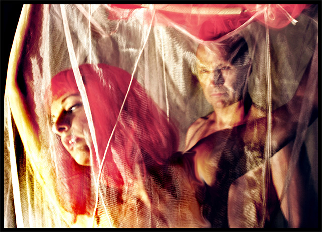
I agree with Dragonlady...this image is so much more than a figure "study"...the "tension" is fantastic, his somewhat smary gaze, her electric pink Cleopatra bob, the textures and garish lighting...the grain and focus all come together to create this one super "loaded" delight...yes, maybe it does make some feel a bit uncomfortable, but that's the beauty of this image.
Since you can't answer any questions I have, I might make the wrong assumptions. Sorry if I do. It looks, to me, like this was taken in a wax musuem which is just acceptable to me as if they were real, but they just don't look real. The netting caused some unfortunate consequenses on the image quality. Looks like front lighting was used. the ribbon in the upper right displays some motion blur. This would have been great if the lighting issues were resolved.
Edit: Ah. bucket? The other one is far superior to this one, imo.
Like the red tones, don't care for the yellows. Personal taste is all. Like the composition/crop, the looks in the eyes of the models. The blur works, the pure black in the upper left draws my attention.
I really like this one, I love the expression on the man, and the setting is great too. Normally I don't fancy unsharp photos, but this really just adds to the whole photo. Nice work! 9
very weird. I like it for its strangeness, and it definitely stands out. I'd have liked a bit more sharpness, and maybe a crop or slight compositional change that didn't result in a pure black spot in the UL. and while the models are presumably nude (at least from the waist up), I don't feel like this really fits the spirit of the nude challenge. If a reshoot is possible, I'd love to see how it comes out--your models look great and they complement each other well.
I'm not quite sure what to say about this picture. colours are interesting, but sort of tanned out. Lighting is bright and seems uncontrolled. There is a sense of erotism coming from the shot, but again, seems a bit uncontrolled as well. Composition is interesting and gives a sense of Hunter/hunted, which helps the models. I find the DOF a bit weak as it doesn't show enought sharpness to the models, sort of blurring eveyrthing in like a dream (perhaps the author's intension?). Unique style and work. 7
I love this image's sensuality and composition..it is unique and dramatic with fascinating lighting; the man in the background's focus is riveting..well done creative image.
I see what you are trying to do with this shot however my tastes do not lie in this area. I as a viewer can not appreciate this form of the art. What I see is a busy photograph that doesn't lead my eye to a specific point. I do appreciate the effort that was put into it however. It took a lot of work and it shows. Thank you for entering.
TC
This had WAY too much going on for e, the screen, the ribbons, the girl, the guy, just too much muddled together. Great composition, and with some more clarity, I think I could really like it, but it's missing that punch.
i like this artsy take on the theme. The lighting is a ligttle harsh, but with this semi-abstract theme, i am not sure that it matters. I do wish the rod was held just a little high so we couldnt see it. This is outthere... and i like that.
This is a very powerful shot, evoking much emotion. So much going on in it and it tells a story. It is not what I would think of as a "nude" if it weren't in this challenge. But because it is so perfect...10






 Add photograph to your favorites
 Add photographer to your favorites

 Photographer found comment helpful.


