I bet this challenge is going to have a lot of great entries, and I hope mine can keep pace. I'm not sure how many people will "get" my title, but I don't want to use "Birthday Suit" as I'm sure that one will already be in use.
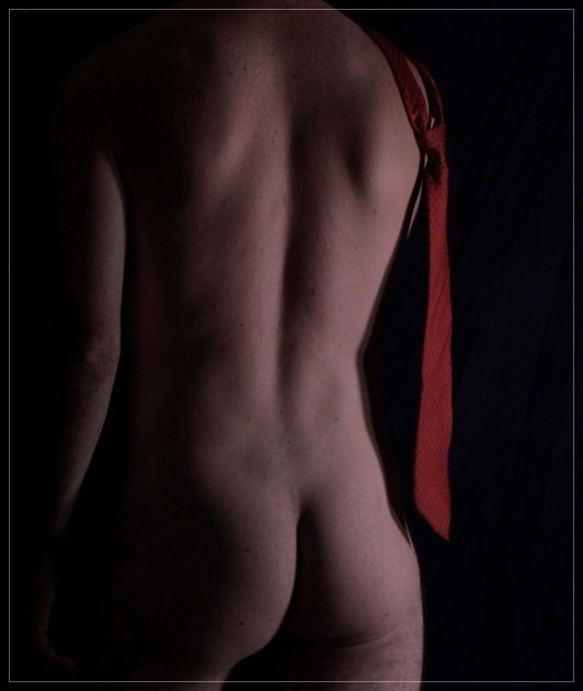
Self portrait
-a little burning of left arm
-cloned out a few spots
-a little selective blurring
-levels
-cropped
-resized
-sharpened a little
-adjusted red channel's lightness to -30, and saturation to -30
-border
Statistics
Place: 77 out of 118 Avg (all users): 5.1029 Avg (commenters): 5.9200 Avg (participants): 4.6163 Avg (non-participants): 5.2075 Views since voting: 5281 Views during voting: 1146 Votes: 486 Comments: 26 Favorites: 0
Excellent topic, and great shot. It's a slight big dark, and there's some wierd lighting on the right leg distracting me. I think with a bit more exposure, it could have been brought up a couple points.
The red contrasts well with the form and I like the shadow along his side. The lighting gives good modeling to his shape. The color looks dull or muddy and the focus seems to be off. Overall I think you did a good job if this is a self portrait. I find it's very hard to get good focus on self portraits.
I like the pose, it is enhanced by your use of lighting. It seems the model is a little dark, perhaps jump up the brightness a little. Upped brightness may also bring out the tie a little more. Nice crop, and I like the border on this shot. Good job.
Idea is nice, but i find the lighting too soft and not strong enought. The frame is interesting (overlay) but doesn't give much to the picture, yet a suspect no frame would not be as good looking. Small details like the left hand, or the tie's tip's shadow on the cheek makes this light study less then perfect. 6
Also nice. Missing a bit of POP though. I can't find any major faults in the image, but at the same time it doesn't hit me as a photo I want on my wall.
Maybe a bit more contrast & brightness would work.
Or a desaturation except for the red tie.
The added tie makes the image in my opinion. The tones are a little dark. the lighting works but would look better with some lighter tones. Composition and crop okay. POV well done. 6 - good luck in the challenge!
i feel the composition could have been improved also maybe the tie could have been more prominent or the lighting a bit stronger... i guess i just dont think the subtle tone works well with this image.






 Add photograph to your favorites
 Add photographer to your favorites

 Photographer found comment helpful.


