Hi everyone and thanks for all your votes and comments. 15 tens for my first entry, wow!
Inspiration - not from mesmeraj's lovely and very similar entry, I hadn't seen it prior to entering. If I had I might not have entered this image but I'm glad I did. Also hadn't seen the HP ad, don't watch all that much TV and it may not shown here in Australia anyway. I had seen something vaguely similar though - a hand holding a Palm Pilot which had an Xray image of the hand on it, as if the Palm was an Xray machine itself. I don't remember if it was here or on worth1000...
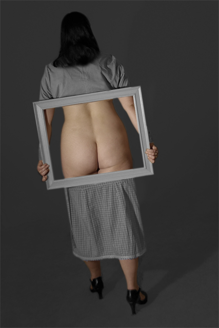
How was it done? A shirt folded and pinned up, a short wraparound skirt tied at midthigh level and a picture frame. I always intended to make the image black and white but oce I did this felt it was missing something, so decided on selective desatutation. I did tone the skin tones down a bit as they were too warm otherwise, I preferred the more muted effect. I had to clone out some picture hooks from the wall, the skirting board, fixed her hair and removed some giveaway wrinkes on the shirt. Used levels to get rid of most of the shadows on the background. Probably should have set the shot up better and spent less time in photoshop, but the final effect was pretty much what I pictured. I did have other shots where the props & hair was better but didn't like the lighting.
Thanks to my beautiful wife for posing and thanks to everyone who complemented her...
Great effort and creativity in this shot. The angle of the model feels odd to me. I like the idea of using diagonals in photography, but maybe a different composition could render that, but make it look more balanced. I like the grey background with the greyish dress too.
What a great photo! This remind me of the HP commercial that were on TV, but with a twist. Great use of the drab gray and black juxtaposed with the flesh! Gutsy photo and unique, which is important. It would have been even more fun to have her against a different background, maybe outside! I like the slight tilt to the image. Awesome job. One of my top 2 in this challenge! Good luck. 10.
Funny that this idea was just used in the last challenge and someone still questioned if it was real. Almost flawless execution. I like how the model's arms are within the frame, it adds to the unreality of the picture. The only nit is the skirt. The waistband showing against the frame sorta ruins the effect. Bumping up because of the work it took to create this.
Not sure this is what HP was going for in their commercials...
Very cool shot. Looking forward to seeing how it was done, although I have an idea already. Technically, I don't think it has much to recommend it. It's dark, the light is flat, and it's not well focused (maybe this is a DOF issue, because the skirt seems fairly clear).
An interesting concept! Nice lighting and compositional work. The overall "grayness" of the image makes it somewhat bland to me. It is, nevertheless, an interesting shot.
very creative! Did you have to destroy a dress or is this actually a skirt and shirt combo? I think it worked out very well, nice and clean job. It would have been impoved if the shadow wasn't there.
I love the shot, it's a great technique, I didn't like the pose, nor the choice of "clothed" outfit. A slight bit of contrast with the background might have brought the scores up, and possibly choosing a different position of the frame, I probably would have brought it up vertically, and rotated it about 15 degrees counter clockwise, to catch a bit of the shoulderblade, and getting away from where the butt meets the leg. Not because of any aesthetics, but to add more pleasing skin, and hiding more of the "taboo" areas.
This is very well done, and I like the meaning of the photo. Lighting is good if not a little dark. Background is great.
The choice of clothing seems a little old fashioned, but of course that may be intentional.
Great take on the challenge. Lighting okay, composition good, crop well done, tones work. You desated a small bit each each arm which is noticible (I only point out editing errors when they are this apparent). This is one image I would have framed if only because of the frame within a frame type thing. 8 - good luck in the challenge!






 Add photograph to your favorites
 Add photographer to your favorites

 Photographer found comment helpful.


