*Critique Club*
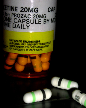
Lighting is an issue in this shot. The pills are almost over lit, and the bottle isn't lit enough. I don't like the harsh shadow created by the front pill onto the pill behind it. It kind of takes a chunk right out of the pill in the back. Probably lighting this more, and just putting a thin sheet or paper between the light and your subject might provide enough light, but cut down on glares created by too much lighting.
While I realize it's probably the label that's tilted, the tilt of the lettering really makes this look like everything is going to slide right off the right side of the photo. See how the lettering doesn't line up with the upper frame of the photo? Being so close to the edge, it's really obviously tilted and creates a distraction.
I'm glad you have cropped this to cut out your address and RX number. I saw a shot once that left all that info in, and I was freaked out. Couldn't believe someone would have given out all that info. So the crop there is appropriate to me. You could have carefully cut it out and then shows the entire bottle, but I don't think it would have been as effective.
Focus and clarity seem to be just fine. Good detail in the pills, and the lettering on the bottle isn't blurred or anything.
The black background also works nicely as there is nothing distracting in the background. Also helps to make the subject stand out.
I think that just about anything would qualify to be in this challenge, so I think it fits the challenge nicely.
~Heather~ |





 Add photograph to your favorites
 Add photographer to your favorites

 Photographer found comment helpful.


