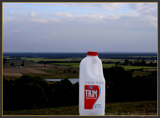
Compositionally you could improve this by getting closer to the jug to more fill the picture and get the lid off the horizon line. Also put the jug on something interesting so the bottom is not cut off. Also the horizon line should be a third from the top or bottom. Good the jug is not directly in the middle. Nice focus and color.
I like the simplicity of the shot. I'm not a technical person, but the only thing I noticed is the cap of the bottle is just about even with the horizon. I wonder what effect it would have had if the cap was either a bit above or below?
The background is underexposed, the horizon could be moved from dead centre (think rule of thirds), and the composition would be improved if the carton was much closer and clearly in focus
The photo is a little too dark and I find myself wanting to push the milk out of the way so I can see what lies behind. Pointing the camera down so the bottom of the milk jug is visible would help ground the photo and would help the viewer feel comfortable with it being the main subject of the photo.





 Add photograph to your favorites
 Add photographer to your favorites


 Photographer found comment helpful.


