*Critique Club*
The comments on this are so funny. And the pic is funny as well since looking at these comments. It is so often that I've seen comments that say "I don't see the * color here". Or "Wheres the color".
By looking at the comments, I think I know where those comments came from. LOL.
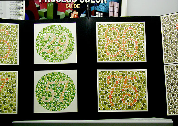
I actually think that they are suposed to be (round) 29 and 57. And (square) 86 and 75.
Well see how I did...maybe it's ME that's wrong. lol
Anyway, about the shot...
I disagree with comments that you should have focused in on one of the boards. This could have easily been seen to violate the artwork rule. So, your choice was a good one. However, the distracting elements, (the upper part, and the table) are still a bit of a problem. Only way to really fix that would be to either shoot from a lower position, and crop out the table or move the entire display, which was most likey out of your control.
i do think though, that shooting from a lower view wouldn't have worked for the purpose of this shot. You wouldn't be able to clearly see the numbers (not like some people can anyway) and I think it would not be visually appealing that way.
SO...you made a good choice.
Focus and clarity are good. I think that the detail in the boards is good, and they are clearly displayed.
The angle seems odd, however, I thin that is the fault of the display itself, and not the photo of the display.
not the most thrilling pic in the group, but it does make a nice point, and it's all the right colors.
Lighting is good, no bright spots or glares on the posters, which I think is VERY important.
A good shot.
~Heather~
Great representation of complementary colors! My only suggestion would be to do a tighter crop, eliminating the guide at the top and the white at the bottom. Good job on lighting and focus:)
"Define your subject precisely and specifically, then include within the viewfinder only what fits your definition." John Shaw
i think if you took a frame with just one of the tiles it would make this subject interesting. I dont get the title so maybe im missing something. good luck
Reminds me of a science fair set up. You have met the challenge, but the composition seems a little haphazard, and it is difficult to find any one thing you want me to focus on (maybe that was your point). I think cropping the "table" at the bottom, and the stuff at the top would have helped some.
Well, this would be bad news to those who are color blind. Very interesting take on the challenge. My only thought would be to crop out the top part of the picture or at least have shot it a little higher to get in the words that were chopped off. 5 Good luck in the challenge.
i guess i'm not color blind. very fun idea. you might have cropped into the four in the center and gotten rid of the stuff below and above which distract the eye.





 Add photograph to your favorites
 Add photographer to your favorites

 Photographer found comment helpful.


