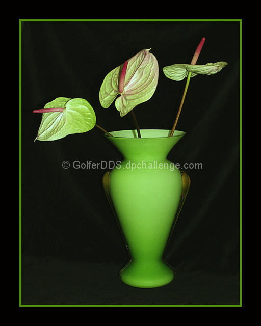
Far too much green to capture the point elegantly. Better might have been red blooms in that vase, though of course the leaves themselves count -- maybe a neutral vase? But a nice, arty shot, I suppose.
The title is very true. I dont normally like large borders, but with this image I think it works well. The composition is clean and simple, the lighting looks good. The only real problems I have is the strange 'outline' effect toward the bottom of the vase, and the possibly creases of the background cloth, most noticeably on the right hand side. It's likely a monitor calibration thing, but it's a little distracting on this monitor.
The colors and background are very well done. There is something about the lighting on the plant that seems a little harsh compared to the softness of the vase and background. I'm wondering if a landscape crop with more negative space on the left would make for a stronger composition. Good pic. 7 -danny
Interesting use of green and red... the complementary color theme would pop a little harder if the green wasnt' overpowering the red so much. The background in this shot is also showing through in a very weak way... maybe more of the background or less of it would enhance the image as well. Good composition and decent choice of subject as well... = 6








 Add photograph to your favorites
 Add photographer to your favorites


 Photographer found comment helpful.


