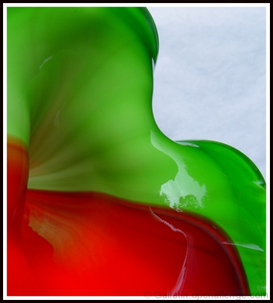
Nice image except that I don't like the light blue background. I would have preferred a darker background of maybe dark red to really compliment the colors in the scene. -T
very fluid - is it a glass vase? It almost looks like paint spraying out over white paper. The lighting (outside - it see the tree) works very well. The background is a little blue is it the sky? (you could use the color cast tool to make it white - gray which might work better. Gorgeous colors, lovely glowing quality, nice composition - colors radiating out from bottom left
neat. i guess that's the sky in the background (since i can see a reflection of a tree in the glaze). the colors and focus are really nice, but i'm not sure if you're really benefitting from taking the photo outside and not using perhaps a plain white/black background because the sky isn't very interesting that day.
The lighting is good as well as the composition. A white sheet held by someone to block the reflection, or a larger aperture to blur it would help keep the eye focused on the vortex on the left. 7 -danny
nice abstract and good use of two complementary colors... I believe that a darker background in the top right could help accent these colors even more... = 6






 Add photograph to your favorites
 Add photographer to your favorites


 Photographer found comment helpful.


