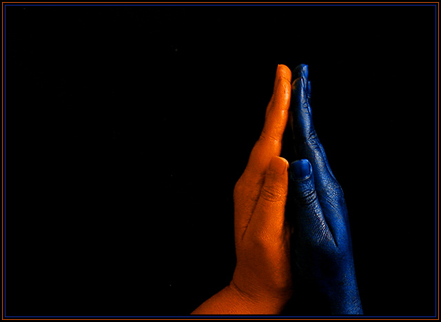
I painted my hands with bright orange and phthalo blue acrylic paint, which took forever to dry and if I touched painted surfaces together, the tackiness would pull off the paint or transfer colours, so this was a TOTAL pain in the ass medium, but the acrylic paint allowed me more movement of my hands without cracking. Used only window light about 2hrs before sunset to light this.
I hung a beige coloured skirt (high tech photography stuff here!) in front of the black background to force my camera to meter properly, and then ran in front of my tripod, laid down, pulled the skirt off my background, layed down put my hands up and waited for the 8 second timer to go off!
Alterations include a bit of hue change to the red channel and selective colour change to the yellows to make the orange look less red, and levels. Cropped to get my arms out of the way.
Statistics
Place: 11 out of 82 Avg (all users): 6.4087 Avg (commenters): 7.2778 Avg (participants): 6.4500 Avg (non-participants): 6.3636 Views since voting: 3791 Votes: 115 Comments: 31 Favorites: 7 (view)
Your photo symbolizes the Indian greeting called "Namaste' (in Hindi and several other Indian languages) The amount of trouble you had taken to get this shot right deserves commendation.
super ! i spray painted my hand chrome for the recent chrome challenge - but trying to photographe my own hand with a remote and wet paint on my hand didn't pan out too well so i entered a bomb instead ;} i feel your pain.
I was just going through some old stuff and I found this photo again. I just love the mystery and elegance of this shot. It was fun reading how you did it! I'm glad it did well; it was certainly one of my favorites for this challenge. The off center composition invites us to see beyond the image, as it were, and implies much more than if it were centered, and the negative space at left does a nice job at creating mood and building the story here. Really fun shot; I love the abstract qualities it possesses! I really look forward to seeing more of your excellent work! --David
*Critique Club*
You recieved some really interesting comments for this.
First off, the right hand (our left) looks orange to me, not red. So I think their moniter must be off. I am mentioning this, just so you know it's not YOUR moniter that's off. lol
The color is definately good. I think that both the orange and blue stand out very nicely. The background helps with this. Although the blue is dark, and the background is dark, I think that the shinyness of the blue hand is what helps it to stand out and not blend in too much with the background. There is nothing distracting in the background, however, there is a small light colored speck to the left of the crease in the wrist of the right hand (our left). If I adjust the brightness up, I can see it better than when it's darker.
I do like the angle and framing/cropping. I like that it's off center, and I think that makes it a little more dramatic and visually interesting. MY opinion though is that I wish that the hands were more symetrical. Some like symetry, some don't. I saw one comment saying they were glad they weren't symetrical. It's just a personal preference thing. I think that I'd like to see it with the orange hand being straight down like the blue hand.
I think it's the simplicity of the shot that I like, and having the hands the same would simplify it even more, to my liking.
Focus and clarity are good as well. I like that we can see the creases in the knuckles and texture of the hands. Great detail.
A really nice shot. Very deserving of the great score. Congrats!
~Heather~
Easily my favorite shot of the challenge. The blues are extremely blue, the orange is golden and the shadows don't distract, with the small exception of the inside of the blue hand - which would have been hard to help without overexposing the oranges. I love the composition - they really are "coming together." 10.
One of my favourites this week. Good composition and the colors are perfect. So is focus and the cropping. I like the colors this dark. Meets the challenge very well. Well done and good luck!
This is interesting, and the impulse to place it against a black background a good one, but why so off-center? I realize dead-center focal points are considered boring by a lot of people, but when the only part of the image with colour is your focal point, centering seems more natural. This feels awkward to me.
The actual topical element is lovely, though. I'd hate to have wash all that off!
Nice image, symbolic but also mildly sexy. The blue female hand is infinitely more expressive, which helps this image a lot, than the orange male hand. The orange hand seems just the result of a color filter or hue sat; it might have been more interesting if it had been painted as well. The light falling on the female hand is also more interesting than that on the male. 7
very nice work... I think you did an excellent job of lighting and exposing this shot. I also think that it would have made a good symmetrical 'vertical' composition as well... = 8
Very nice work. The use of lighting to set the mood works very well. I like that the orange hand is not symmetrical with the blue. This adds interest to the shot. I wouldn't mind just a bit more catch light in the front to illuminate the base of the blue hand more. Excellent work. 9 -danny







 Add photograph to your favorites
 Add photographer to your favorites


 Photographer found comment helpful.


