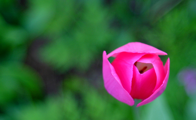
That really is the color of this tulip! Okay, the camera's color saturation was two steps above default, but that's just to get the Velvia-film look in the shady lighting. Postprocessing consisted of a slight crop, level adjustment, and bumping the saturation of the greens. Sorry about the less than perfect sharpness, I should have used a tripod.
Statistics
Place: 50 out of 82 Avg (all users): 5.3028 Avg (commenters): 6.6875 Avg (participants): 5.1833 Avg (non-participants): 5.4490 Views since voting: 1180 Votes: 109 Comments: 18 Favorites: 0
Composition - A pink tulip! wow I can't say I've ever seen one of these. My last submission for primary colors was 2 tulips, of mixed colors. I had red and white ones in my backyard, but not pink! I think this one had just a little too much breathing room. I'd have cut some off the left side. I think it might have been a better option if the picture was just a shade crisper. I'm not so sure pink and green count as complimentary colors, but for the sake of argument, we'll say they are. Conceptually it is very good and this is a good flower for it...Nice straight stem.
Technical - Just a pinch off on the focus. That little bit matters a lot in macros though. That's obvious though, I'm sure I'm not telling you anything there. Maybe a tripod was in order for this shot. The exposure is right on and the DOF is great with it being so shallow. The colors all look nice and bright and there's no obvious oversharpening or saturation. It's all in the focus that I find any problems.
Overall - After thinking about the crop, you did the right thing. IF this were pin sharp, then I think it would've been in your best interest to crop it a little tighter. Since it isn't, I think you're best off as it is. Its a good shot, and works conceptually, but it just wasn't pulled off as clear and clean as it could've been. Best of luck - Bob
interesting abstract...I would prefer a little sharper focus on the main subject, although I can see you intended it to be this way. The blueish color to the right of the flower is a little distracting. The colors don't match the challenge though.
WOW! Definitely has the "wow" factor. I had my point of view for the picture then the title gave it a whole new spin. Very cool. Not a single thing wrong with it. Except for maybe that it isn't really a true red.....but who cares right? - 10
I'm really running out of things to say about flowers against grass. As with a couple others, I think this would have worked better with a redder tone to the flower, nad I think maybe less blur of the greenery, but it's certainly topical and not by any means a bad shot.
I really like this image a lot. Yes, i can clearly see it is a flower but thanks to your capture from above it has also assumed another appearance, as your title aptly points out. I love to see flower picture; in last week's challenge there were tons of them. By now, i am pretty much saturated of the accurate documenting of 'pretty' flowers and flowers need to be done with a different take, in an original matter, to make impact on me. This was does that. Beautiful rich colors of the flower. Don't even know whether it is a tulip or what and i really don't care. I like the simplicity of the image and i also appreciate originality. 9
Just doesn't quite seem completely sharp - presumably that macro DOF thing: the top of the flower is OK, but lower down the petals has started to go out of the field, which doesn't dissociate the flower from the background in the way your title implies you wanted. It also seems more pink than green, but that's only a minor point after all these colour challenges.





 Add photograph to your favorites
 Add photographer to your favorites

 Photographer found comment helpful.


