Challenge:Black & White (Classic Editing) Camera:Nikon Coolpix 880 Location: USA Date: Jun 2, 2002 Aperture: Not Listed in EXIF ISO: Not Listed in EXIF Shutter: Not Listed in EXIF Date Uploaded: Jun 2, 2002
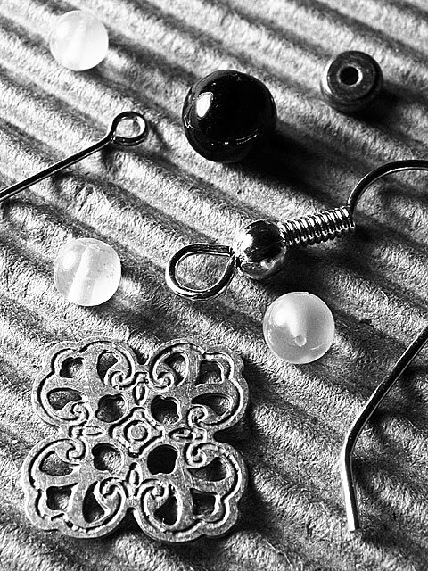
Photo #27 out of 34 on this theme. The background is corrugated paper. The light is my ever-useful 60-watt clip lamp, which can be seen reflected in the garnet bead. I kept the green channel, removed the color, equalized, and applied unsharp mask before and after resizing.
Statistics
Place: 88 out of 153 Avg (all users): 5.2395 Avg (commenters): 6.6111 Avg (participants): 5.3750 Avg (non-participants): 5.1190 Views since voting: 1166 Votes: 238 Comments: 21 Favorites: 1 (view)
I voted this a 9. I wish it had placed higher. I really loved the textures and the fact that it shows only "parts" of the objects. I just loved the contrast and the detail of this....sorry it didn't do better.
Excellent contrast and sharpness here - highlights are bright white, but detail is preserved, and the blacks are nice and dense. Good choise of bg, too. The diagonals add interest to the layout. It does go ever so slightly soft at the bottom (don't mind it at top).
Nice macro, great detail, love your background, but a bit busy for the "coin" in the lower left corner, or maybe too similar color value. The edges of the "coin" are clearly distinct, but because the color values are so similar, it wants to blend in slightly. All the other elements work well. Nice job! Photo 9 Creativity 8 B&W 7 total 8
the contrast and texture on this pic is unreal. the arrangement is very pleasing as well. the top left bead is a bit blown and unsharp so I give this an 8 : )
I think this subject would look excellent on a solid white surface.. the diagonals are nice, but the texture of the background surface make this photo seem a little 'busy' to me...
I think I'd have played with the levels of this shot, as the whole image seems to sit right around the mid-tone level. I think pushing the dark and light tones further towards their respective poles would have made the objects stand out even further from the great texture you have.
This one seems a bit too sharp for me. The edges are a bit too drastic. I like the overall arrangement, but the contrast does not make it feel very warm to me.






 Add photograph to your favorites
 Add photographer to your favorites


