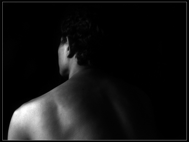
This man's body seems out of proportion to me. Perhaps it is his position and the lighting that makes him look as if he has a massivly broad shoulder with a small head.
I like the lighting of this subject. I think this photo isn't what they are looking for, for this challenge. I think it may be too dark. I hope I am wrong. Good luck.
Tiitle is interesting but the photo doesn't have a lot of interested. Needs something to draw views attention to it and keep it there instead of just a glance.
Very nice skin tone. A little light on the background on camera right would have created some separation between the model and background. My monitor is calibrated and I can just see the triangle formed by the shoulder on the dark right side. I think that side is need to balance out the broadness on the other shoulder.
A very nice angle, and figure study. The border hurts it more than anything, but I think a bit different angle to level off that shoulder would have given a more pleasing angle to me.
I like the tone range across the back, though I think that maybe just a little more light on the hair would add some extra interest. I like the border here too.
I love this effect but it needs a little more to keep me looking at it. Maybe if it was shot on the vertical and ended at the small of the back there would be enough to keep my attention longer. Love to fade from light to black.
this image is a little flat - i thought it might be a bit to dark, but i dragged it into ps and pulled the curves down, and it actually needed just a little *more* shadow to pop. Funny how these things can be, but just a little darker defines the shoulder and makes the muscles more distinct.






 Add photograph to your favorites
 Add photographer to your favorites


 Photographer found comment helpful.


