*Critique Club*
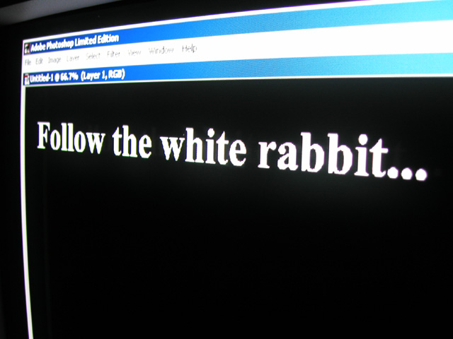
I've never been fond of the computer screen/tv screen shots. I think that they are easy and lack creativity. Also, they are really borderline (and sometimes do) in breaking the 'work of art' rule in the challenge rules. As a moderator, we've gone around and around with these kind of shots. Looks like you made it this round.
About the shot. Being done in Photoshop, you'd think this would be flawless. however, there is a white spot above the W in the word WHITE. I find that strange and distracting.
I wonder if this would have looked better if you had set your screen saver to "scrolling marquee" and typed this in, then set your marquee to SLOW REALLY slow so you can take a pic of it. You can set the background color to black and the font to white. This would have eliminated all the 'junk' at the top of the screen.
The focus on the words is good, nice and crisp, however, the focus on the upper part is really blurry, which makes it an even bigger distraction.
Not my style really.
~Heather~





 Add photograph to your favorites
 Add photographer to your favorites

 Photographer found comment helpful.


