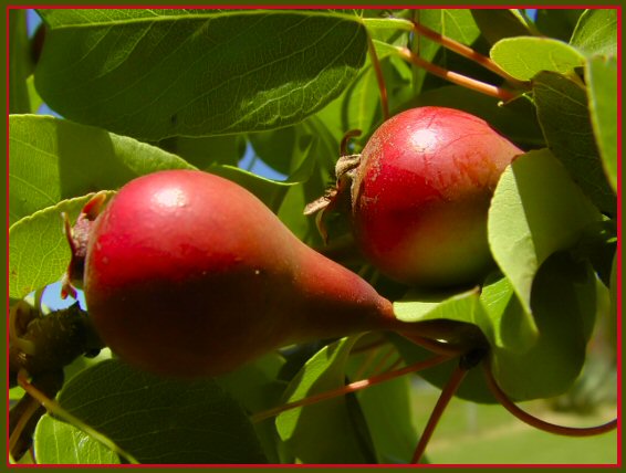
Composition - 2 small pears in a tree. I can't say I've paid too much attention to baby pears before. Around here we seem to have more green ones than red. The framing of this shot is pretty good. I think if the pears were not as close on the vertical plane it would've strengthened the shot by taking out a little of the green and making the part we viewers focus on a little broader. Usually I find myself saying the opposite, but each pic is different. The photo has a nice balance to it. The colors if they were a little more equally distributed would contribute to that. The green is a little overpowering.
Technical - This needs to be focused better, and that's the bottom line. The rest of the pic would've scored reasonably well but it's just not as focused (or focused in the right spots) as I think it should've been. The exposure is pretty good and as a result, that helps the color of this photo.
Overall - A pair of predictable complimetary colors. This just wasn't executed to maximize the potential of the subject. I think the composition is adequate, but not outstanding. Maybe it would've been a little better to alter the angle a little to achieve a more unique perspective on these 2. I think that would help a lot the more I think about it. Hope this could be of some use to you. Good luck and keep shooting - Bob
Very nice capture of complementary colors in nature. Great composition. Normally, I prefer one color borders, however, I feel the two color border here works quite well. Good job!
I would have preferred to see you use something to bounce the light in front to eliminate the harsh shadow and show off the beautiful colors of the pears.
Nice colors and compostion.
interesting colors... the 'pear' wants to be vertical in my mind... maybe thats some preconceived notion I need to abandon :) Focus on the left pear seems to be a tad soft... = 5






 Add photograph to your favorites
 Add photographer to your favorites


 Photographer found comment helpful.


