Hello from the Critique Club- I like to day a couple of days to think about a photo before I review it.
What a great start for your first entry! 20th place is impressive and so is a score of 6. Unfortuneately I was one of those "middle of the pack" voters. I gave you a six.
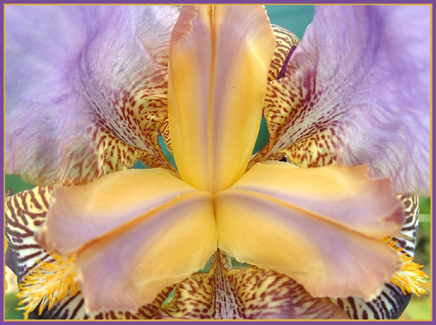
I'll start with the good stuff. Exquisite focus, just lovely depth of field. All of the flower is in tight focus and the background green is blurred. The petals protuding in the center are just as sharp as those behind and the fuzzy pollen laden stamens (or is it pistons?). Great colors, very subtle but well balanced yellows and purples. Perfect lighting! soft and again subtle, feels like early morning fresh. Nice interplay of texture and pattern. The smooth center petals contrast with the busy spots of the outer petals and the bright yellow pollen. The weight is right too, the heavier darker, busier elements of the photo are near the bottom and the lighter, airier lavendar petals are at the top.
And then the bad stuff - this is what separates a good photo from a great one. Your composition is pretty basic, a straight on shot with the object of interest in the middle of the frame. You have only one center of interest and all the leading lines point there. This shot is perhaps too symetrical to forgive the slight assymetries. Why is the top petal cut off? Would a more square format have suited the flower better than the standard rectangle? What if you rotated it ever so slightly so that the lower petals were at the same angle?
Or better yet...what if you had abandoned the symetry altogether. Have you read the tutorial on the rule of thirds. All rules are meant to be broken, but also they are meant to be mastered. Would the flower have been more dramatic and less static if it had been placed off center in the frame? taken from an angle? had a more (or less) contrasty background.
In the DPC lingo, you need something more to take this from "nice" to "WOW".
Disclaimer: remember that this is only my opinion and I an NOT an expert.
I'm afraid this one didn't grab me topically as much as some of the other flower pictures -- the colours are in fact complementary but the lack of vividness in them doesn't make it quite as obvious. Also, for some reason, the flower itself looks actually rather scary.
I think that since the lower two petals are not cropped, it may be better balanced if the top was not as well. Having said that, the lines really draw the eyes into the picture. Great composition and lighting, as well.
nice exposure...colors are a bit too muted, i'm having a little trouble figuring out what colors are complementary here. focus is pretty good, and i would have used a black or white background to create more contrast between the flower and the background...4
This image is troublesome to me and i'll tell you why. These colors here clash, or in any case aren't particularly pleasing to my eye. And yet, i bet, that in reality this flower is just beautiful as i have never seen a flower that is not beautiful in its own way of perfection. The yellow and the mauve of the center petals are beautiful, the rest reads as 'too busy' for me. Maybe what accounts for my discomfort is that it was taken out of context and the overall look isn't softened by quiet leaves. The dof on the top mauve petals adds to this feeling of busy-ness. 7






 Add photograph to your favorites
 Add photographer to your favorites

 Photographer found comment helpful.


